


A construction company logo should identify the business clearly on documents, workwear, vehicles and project-site material. Start with 4 applications: a quotation, a site board, a small digital profile and a production sample such as embroidery or signage. Choose a concept that survives those uses rather than judging it only on a polished mock-up.
Construction-logo searches often return design examples and logo makers. Use them to explore directions, not to copy another contractor’s identity. A roof, crane or building silhouette can suggest a sector, but the design still needs to distinguish the actual business. Its visual symbolism must not imply professional accreditation or capabilities the company does not hold.
An original visual concept comparison
The illustrative sheet below uses the fictional name KILO BUILD. It compares a name-led wordmark, an initials-led arrangement and an open structural join, with quotation, site-board and small-profile applications. It is original editorial artwork, not a client commission, available trademark or production-approved sign.
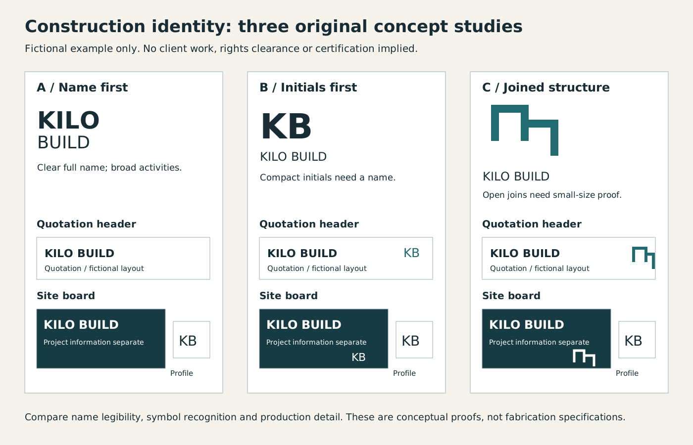
The name-led direction keeps identification explicit; the monogram is compact but needs the full name alongside it; the joined shape adds a recognisable structural idea but its open gaps need small-size and fabrication checks. In the lower applications, compare the actual name hierarchy and the extra symbol rather than judging colour alone. The profile uses initials and therefore loses the full name unless the surrounding account label supplies it. Keep that trade-off visible in the brief. These examples demonstrate questions to inspect, not measured legibility or rights clearance.
Which construction logo direction should you explore?
The following are original concept directions for a design brief. They are not finished marks, available trademark names or representations of existing Spout clients. Compare each against the business’s actual name and activities before developing artwork.
| Direction | How the idea could work | What to avoid |
|---|---|---|
| Strong wordmark | Make the company name the main identifying element | Condensed lettering that becomes unreadable on a vehicle |
| Distinctive monogram | Develop a recognisable arrangement from the actual initials | A generic symbol shared by unrelated contractors |
| Abstract structural mark | Suggest joining, support or precision without a literal building | Detail that disappears at small sizes |
| Carefully chosen sector reference | Use a relevant visual cue beside a clear name | Implying a specialism the business does not offer |
A company covering several kinds of construction may outgrow a logo tied to one narrow object. Conversely, an abstract symbol may need a clear accompanying name before anyone understands who it represents. Decide how much sector explanation belongs in the logo and how much belongs in the surrounding service description.
Test the actual name early. Long names, abbreviations and legal suffixes need an agreed hierarchy. Do not shorten a name in a way that misidentifies the business merely because the result fits a mock-up. Ask the responsible owner which form is appropriate for signs, formal documents and everyday marketing.
Why do source files and distinctiveness matter?
Adobe’s SVG explanation distinguishes vector graphics from pixel-based images and explains their ability to scale. That makes a properly prepared vector asset useful for adapting a logo to different sizes. It does not guarantee that any particular artwork will print well or work for every fabrication process.
Request editable source artwork and appropriate exports for the agreed applications. A small screenshot is not a substitute for the original design. The sign maker, embroiderer and website implementer may need different files, so ask each production provider for the format and limitations relevant to their work before promising a universal package.
Distinctiveness requires attention beyond file quality. The USPTO’s strong-trademark guide explains, in the United States context, why descriptive or generic marks differ from distinctive ones. That is useful conceptual background; it does not establish Zambian registration eligibility, clearance or protection for a proposed construction logo.
Keep legal clearance separate from a design preference. A search for visual inspiration is not a rights search. If the business intends to register or use the mark in a particular territory, establish who will check the applicable rights and naming requirements. Do not assume that an unused social handle proves the mark is legally available.
How should a construction logo be tested?
Create an application sheet using ordinary, inconvenient conditions. Place the design on a detailed quotation, a phone-sized profile and a site-board layout that includes real contact information. Ask someone unfamiliar with the concept to identify the business name. That is more informative than asking whether the logo feels premium.
Test the relationship between mark and information. On a site board, the business identity, contact route and project information have different jobs. The logo should not consume so much space that essential details become illegible. Nor should it resemble a safety instruction, statutory notice or certification badge when it is merely branding.
For workwear or vehicle applications, discuss production constraints with the actual provider. Fine lines, small gaps and elaborate effects may need simplification. Treat a physical sample as evidence for that method and material, not as proof that every other process will produce the same result.
Use this original construction-logo proof ledger:
| Application | Specific check | Evidence to retain |
|---|---|---|
| Quotation | Company name remains clear beside detailed line items | Realistic document proof |
| Site board | Identity is distinct from project and safety information | Layout using actual required content |
| Vehicle | Name and contact information remain recognisable in the proposed placement | Production layout checked by the provider |
| Workwear | Fine details and spacing survive the chosen method | Physical sample where appropriate |
| Digital profile | Crop does not cut off essential identification | Actual small-size preview |
| Website header | Logo works with navigation and ordinary page content | Desktop and phone checks |
| Handoff | Source, exports, rights and usage rules are identifiable | Organised approved asset set |
The ledger deliberately avoids invented viewing-distance or line-thickness rules. Appropriate specifications depend on the production method, placement and actual artwork. Ask the provider for the requirement and test the result rather than treating a generic internet number as a universal standard.
What belongs in the final design brief?
Describe the business’s actual activities, audience and intended applications. Include existing materials, any naming decisions and the reason for a change. If the current logo has recognition worth retaining, explain which elements matter. A refresh should not discard useful continuity merely to make a new concept look dramatically different.
State restrictions clearly. These might include avoiding an unheld accreditation symbol, retaining an established colour relationship or distinguishing the company from a similarly named business. Do not ask the designer to imitate a competitor so closely that the result becomes confusing.
Agree how concepts will be evaluated. Use clarity, relevance, distinctiveness and application performance rather than collecting unrelated preferences from many people. Record why a concept was selected and which issues were resolved. Keep rejected artwork separate from the approved files so that it cannot accidentally reach production.
See logo and brand design for the related identity work. To explain a construction-logo requirement, get started with the correct business name, activities, existing assets and the applications that need to work.
By Spout Team. AI-assisted drafting by Codex using the linked primary sources.