


A 3D logo direction works best when its depth follows a clear structure rather than relying on an elaborate mock-up. The original studies below explore planes, a folded ribbon and stepped volume. Compare the silhouette and smaller counterpart before deciding whether dimensional treatment helps the identity.
These are original Spout illustrative concept studies, not rendered photographs, client logos or existing brands. The SVG files use drawn planes to suggest depth. They are useful for comparing a direction and discussing a production brief; they do not claim a finished three-dimensional model or trademark clearance.
What should depth contribute to the identity?
Decide whether the dimensional treatment is the primary identifier or an optional expression of a simpler mark. A symbol that only works with a particular shadow or camera angle can be difficult to reproduce on a document, small label or cut material.
WIPO recognises three-dimensional features among possible trademark forms, alongside words and drawings. That general description does not establish that a particular shape is registrable or available. Keep visual development separate from the applicable rights investigation. WIPO trademark forms.
For these studies, the memorable feature is the relationship between planes. The palette distinguishes those planes, while the overall outline provides a second way to compare them. No metallic effect or simulated product photograph is needed to understand the underlying construction.
Folded prism: depth around a central seam
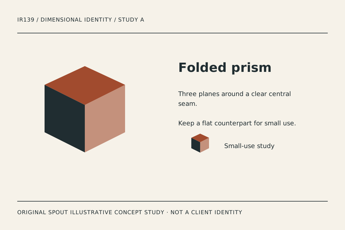
Folded prism places three planes around a shared seam. The top face carries the accent, one side carries the dark ink and the other uses a lighter plane. The intended effect is a compact object whose orientation is easy to inspect.
The visual risk is familiarity: a simple prism can resemble many existing marks. The drawing’s originality does not make its basic geometry exclusive. If this direction is pursued, the final identity needs a more specific relationship to the business and an appropriate resemblance investigation.
Test a flat counterpart that retains the seam or a deliberate cut. Do not depend solely on three colour values if the mark must appear in one ink. A photocopied document is a useful practical comparison because it removes much of the plane distinction.
Ribbon axis: a turn rather than an extrusion
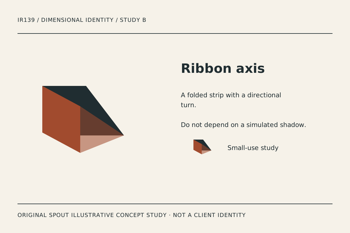
Ribbon axis suggests a strip folding through space. It differs from the prism because the eye follows a directional turn instead of reading a closed volume. That may suit a brief about movement, transformation or a connected process, provided those are design themes rather than unsupported business promises.
Inspect the point where the planes meet. A narrow wedge can become visual noise when reduced, and a long wordmark can compete with the ribbon’s direction. Compare the symbol with the actual name before committing to an animated or perspective treatment.
If animation is later proposed, specify what remains when motion is unavailable. The static identifier should still be clear. These SVGs are static studies and do not imply that a motion sequence or interactive model has already been produced.
Terraced volume: depth through repeated levels
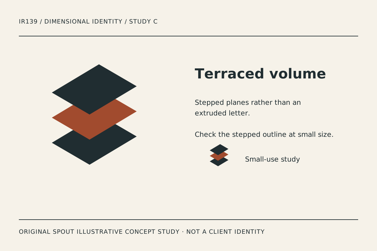
Terraced volume uses separated diamond-like planes. The repeated levels create a stepped reading without a continuous enclosing wall. It is the most vertically rhythmic direction in the set.
Its strength is the recognisable stack. Its risk is that the gaps can close in coarse reproduction or become too loose when the mark is enlarged without reconsidering spacing. Test the actual output rather than assuming mathematically equal separation always looks balanced.
A final version might reduce the number of planes for a smaller application, but that would be a deliberate variant requiring its own comparison. Do not allow automated export to remove details unpredictably and call the result a responsive logo system.
Which direction survives the intended application?
| Direction | Depth mechanism | Flat-use question | Production concern |
|---|---|---|---|
| Folded prism | Shared central seam | Can the seam remain distinctive in one ink? | Familiar geometric silhouette |
| Ribbon axis | Turning strip | Does the directional turn remain readable? | Narrow meeting points |
| Terraced volume | Repeated separated planes | Can a simplified stack preserve identity? | Gaps closing in reproduction |
This is an original design comparison, not a claim that one direction is more effective in every market. The right choice depends on the name, audience and applications in the brief.
A dimensional identity handover checklist
Retain a flat vector master, the selected dimensional treatment and a record of the intended light or plane logic. If a future designer adds a different shadow direction, the mark should not accidentally change its apparent construction.
Specify the smallest application that matters and test there. Include an ordinary document header, a small digital avatar and the actual production process planned for signage or packaging. Record the observed failures, not an invented universal minimum size.
The SVG viewBox maps drawing coordinates to the viewport. That supports scalable delivery but does not turn an unsuitable detail into a readable one. Preserve the intended proportions and inspect the result rather than stretching the artwork to fill a convenient rectangle. W3C SVG geometry.
For accessible gallery use, describe the planes and construction honestly. If the final mark becomes a link, its text alternative should explain the destination or action instead of merely announcing a decorative object. W3C functional-image guidance.
Download the studies to compare structure, not as evidence of a completed commercial identity. Keep the rights and final production decisions attached to the chosen version so a presentation mock-up does not become the only master.
Discuss the direction through Spout’s logo and brand design service or start an enquiry with the preferred construction and intended applications.
Include a flat small-size version in the web development brief instead of assuming the volume study suits every website header.
By Spout Team. Prepared with AI-assisted drafting and original SVG concept artwork.