


A logistics logo should remain identifiable on documents, workwear and a vehicle without making unsupported claims about fleet size or geographic coverage. The original studies below explore a relay path, a transfer bridge and stacked depot tiles. They offer different visual strategies rather than interchangeable truck illustrations.
All three are original Spout illustrative concept studies, not client identities, carrier marks or official transport symbols. Download the SVGs to compare their construction, then test the preferred idea beside the real business name and the services the business actually performs.
What should a logistics identity communicate first?
Specify the operating model before choosing a symbol. Freight coordination, warehousing, courier work and specialist transport are different propositions. An abstract route can support several of them, but the accompanying wording must state the actual service clearly.
Do not add maps, country outlines or an international descriptor merely to make the company look larger. A mark can suggest movement without claiming a network the business does not operate. Likewise, a depot reference should not imply ownership of facilities unless that is true.
WIPO describes a trademark’s role as distinguishing one enterprise’s goods or services. That makes a distinctive identity useful without requiring a literal vehicle or globe. WIPO trademark overview.
Relay path: movement through visible stages
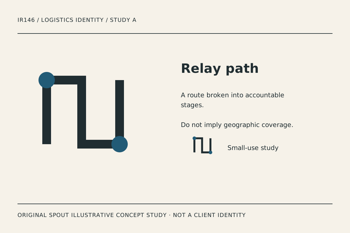
Relay path uses a stepped line with distinct endpoints. The intended reading is a sequence of handovers rather than uncontrolled speed. The accent identifies the endpoints while the dark structure carries the route.
Its usefulness depends on preserving the open spaces between the vertical segments. In a small document stamp, those spaces may narrow and make the route look like an unrelated block. Inspect the actual output before deciding the line weight is sufficient.
The drawing is not a real route map. Do not place named destinations beside it in a way that implies verified coverage unless those services are established separately. Treat the route as a visual metaphor and keep commercial claims in accurate copy.
Transfer bridge: a handover between systems
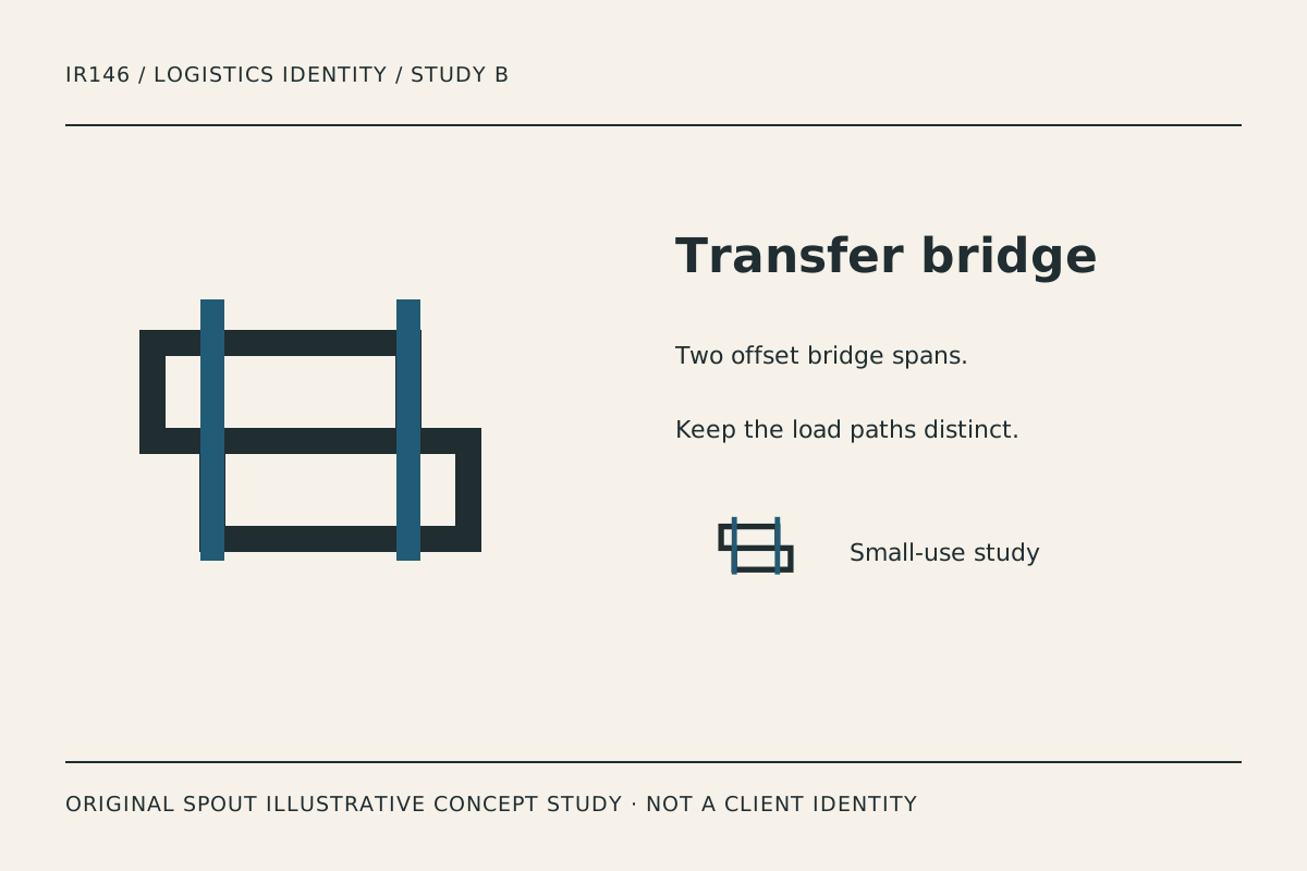
Transfer bridge combines offset rectangular spans with strong vertical accents. It suggests connection across two levels, making it a candidate for a brief focused on coordination or transfer rather than a single mode of transport.
The structure offers a broad horizontal silhouette. That may sit well beside a name on a consignment document, but a long name and a wide symbol can compete for space. Compare a stacked arrangement as well as a side-by-side lock-up before choosing the final proportions.
The crossing bars are an important production test. If the accent disappears in one-ink use, decide whether the bridge remains recognisable or needs an intentional alternative. Do not assume a colour separation that works on screen will survive every print process.
Depot tiles: a system of stacked units
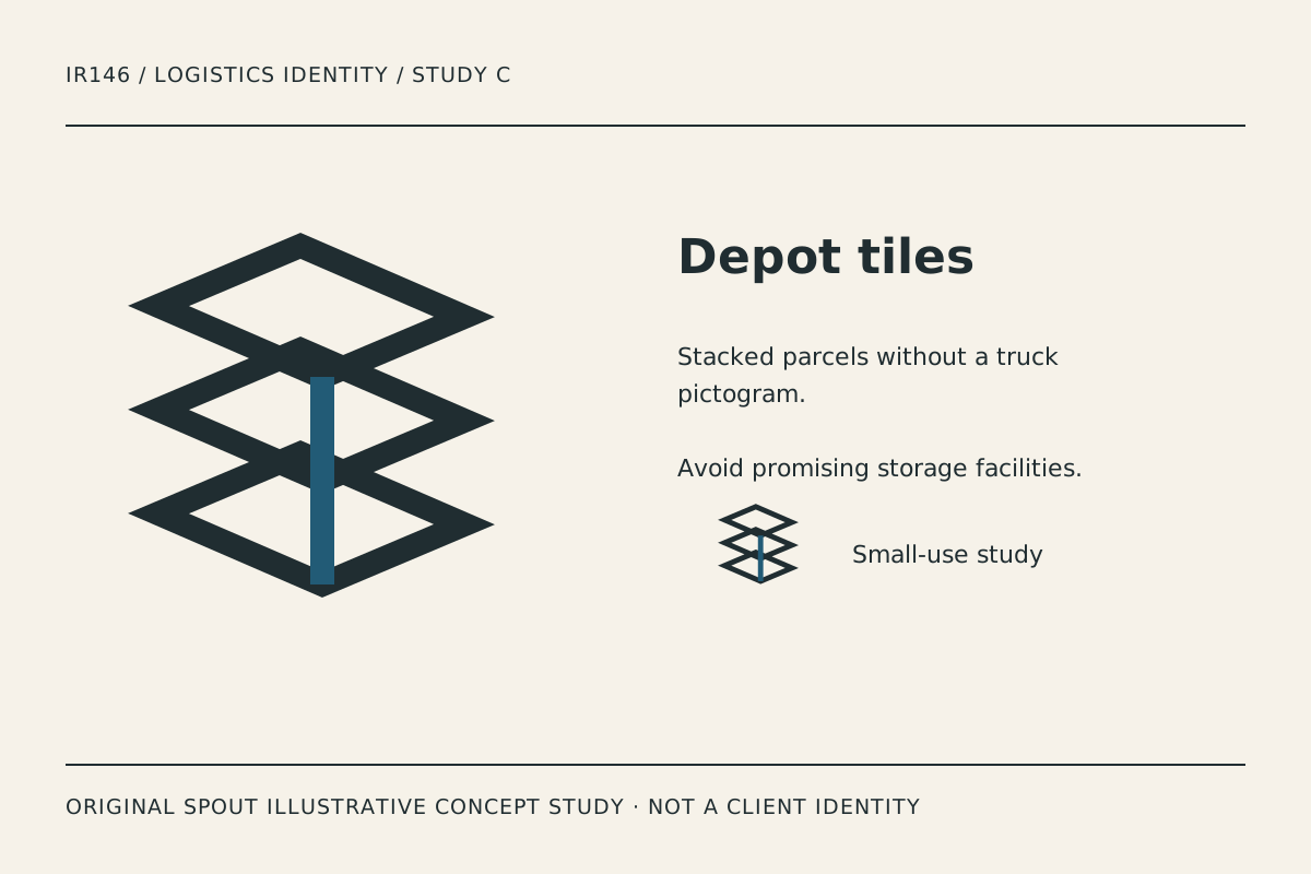
Depot tiles uses repeated open planes and a linking vertical stroke. It refers to organised units without depicting a specific warehouse or inventory system. The rhythm is more architectural than the relay path.
This direction has the greatest density at the overlaps. Test whether the central junction remains clear on workwear and small labels. If the intersections become noisy, reduce the number of lines or change the spacing deliberately in the master.
A stacked motif can also resemble many existing geometric marks. Its original construction here does not establish exclusivity. A final identity should develop a specific relationship to the business name and undergo the appropriate resemblance investigation.
How do the studies behave in a logistics brief?
| Study | Intended idea | Useful comparison | Failure to watch |
|---|---|---|---|
| Relay path | Accountable stages | Document stamp and small avatar | Narrow gaps closing |
| Transfer bridge | Coordinated handover | Long-name document heading | Wide lock-up becoming cramped |
| Depot tiles | Organised units | Workwear and labels | Overlaps becoming congested |
These are editorial suggestions, not measured visibility results. A vehicle application needs a real layout that respects the vehicle’s surfaces and other required information; a logo study alone does not supply that layout.
A logistics application proof sheet
Create a proof sheet with the actual business name, principal service description and contact details. Apply the preferred study to a plain document heading, garment sample and a representative vehicle panel outline. Keep the examples clearly labelled as proposed applications.
Inspect the mark at the viewing conditions that matter to each use. A document is read at close range; a vehicle is encountered differently. Do not invent a universal legibility distance or claim the symbol has passed a road-visibility test without performing one.
Record the smallest version used, the production process and the detail that fails first. The SVG viewport and viewBox support proportional scaling, but they do not justify stretching the symbol to fit a door or label. W3C SVG geometry.
For web use, distinguish a linked business logo from the informative images in this gallery. W3C advises action- or destination-based alternatives for functional images. The study captions instead explain the visible construction and its illustrative status. W3C image guidance.
A final handover should retain the master, approved variants, colour references and the actual wording authorised for use. Avoid invented accreditation text, unverified service regions or a client list that does not exist. Design should organise the business’s truth rather than supply a larger fictional operation.
Discuss a specific identity through Spout’s logo and brand design service or start an enquiry with the preferred study and proof sheet.
For a multi-service business, test the same identifier beside each truthful service descriptor. Keep the symbol consistent while checking that the wording does not imply the business owns vehicles, warehouses or overseas branches it merely coordinates through another arrangement. The visual identity should not blur those distinctions.
Include the small dispatch-screen version in the web development brief as well as the vehicle application.
By Spout Team. Prepared with AI-assisted drafting and original SVG concept artwork.