


A food brand logo should be recognisable on the pack and useful beside the information a customer needs. It should not turn a decorative ingredient reference into an unsupported nutrition, origin or certification claim. The original studies below explore a seed and bowl, a woven grain structure and a turning peel.
These are original Spout illustrative concept studies, not existing food brands, client projects or cleared trademarks. The SVG downloads provide concrete ideas to compare on a label or package brief. They are supporting artwork, not photographs of an actual product.
Which food story is the brand entitled to tell?
Start with the real product, producer and selling context. A packaged snack, a pantry ingredient and a prepared meal may require different visual priorities. Do not choose a farm-like symbol if the business intends to imply a sourcing or production story it cannot substantiate.
Separate the identifier from product information. The logo can help people recognise the brand while the label communicates the actual product, ingredients and applicable information. This guide does not provide a regulatory label checklist or approve a food claim.
WIPO recognises words and drawings as possible mark forms and notes that marks distinguish goods or services. A food identity therefore does not have to depict the product literally. WIPO trademarks.
Seed bowl: a simple relationship between ingredient and serving
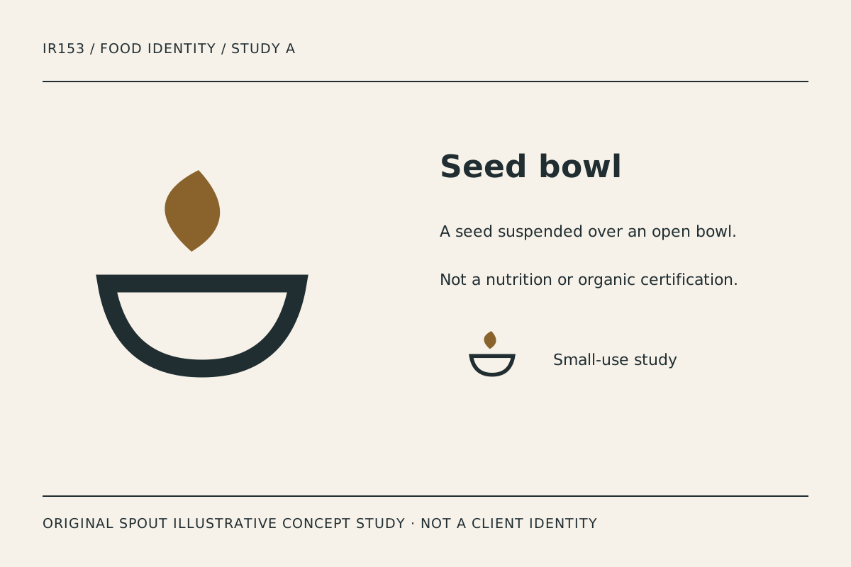
Seed bowl places a single seed-like form over a broad open bowl. The contrast between the compact upper shape and lower curve gives the study a clear hierarchy without adding a detailed illustration of a meal.
The seed is a visual idea, not a claim that the product is plant-based, organic or nutritionally superior. If the final business uses the direction, the actual product wording must remain accurate. Do not let a design association substitute for evidence supporting a label statement.
Test the gap between seed and bowl on the intended package material. If it closes, the two forms become a different silhouette. A small pack may need a simplified relationship rather than a miniature copy of the largest artwork.
Cut grain: structure instead of rustic decoration
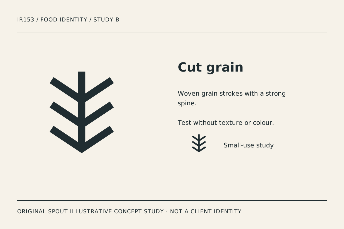
Cut grain uses a central spine with repeated diagonal strokes. It suggests grain or a woven structure while remaining geometric. Unlike a detailed wheat illustration, the design does not depend on many small kernels to be understood.
The repeated strokes can provide a coherent family for packaging patterns, but that possibility is not already a completed brand system. First establish that the main symbol works beside the product name and does not compete with essential label information.
A one-ink print is a useful comparison. Watch the narrow meeting points and the spacing between strokes. If they become congested, simplify the geometry deliberately. Do not add distress texture to disguise a weak outline or create an invented heritage story.
Peel signal: movement through a broad turning line
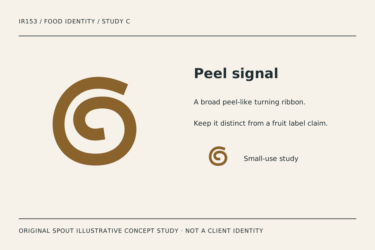
Peel signal is the most expressive study in the set. Its broad turning stroke suggests a peel or an unfolding ingredient without illustrating a specific fruit. The open end and inner turn create the distinguishing relationship.
The risk is overinterpretation. A viewer may read a different food or a letterform, so compare the mark with the actual product and name rather than assuming the intended meaning is universal. Record those observations as design feedback, not a consumer research statistic.
The inner opening is important at small size. A reduction that fills the opening can make the study look like an ordinary solid disc. Preserve the opening in a deliberate small-use variant if the final production method requires one.
Which idea belongs on the pack?
| Study | Visual starting point | Packaging test | Claim boundary |
|---|---|---|---|
| Seed bowl | Ingredient and serving | Small label and seal sticker | No implied nutrition certification |
| Cut grain | Structured natural reference | One-ink carton or paper wrap | No invented provenance story |
| Peel signal | Expressive turning line | Curved container and profile image | No assumed ingredient identity |
The table contains original design analysis. It does not establish food safety, product quality or commercial effectiveness. The choice should follow the product brief and actual application evidence.
An original package-fit record
Place the selected study beside the real product name on a flat label layout. Reserve the space the actual product information needs before enlarging the logo. A brand mark should not make essential wording unreadable.
Record the package shape, material, printing process and smallest intended use. Test a flat proof before judging a styled mock-up. A curved container can distort the visible relationship between the symbol and the name, while a textured material can affect open spaces.
Keep the master vector and note any approved simplified form. SVG defines the drawing area and its coordinate mapping, which supports proportional delivery but does not guarantee that every detail survives reduction. W3C SVG coordinate systems.
For a digital product listing, provide a useful text alternative for informative artwork. If the final logo becomes a homepage link, the alternative should identify the destination or action rather than just the shape. W3C functional images.
Before commercial adoption, investigate the proposed name and resemblance to existing marks through the relevant process. Original studies are not clearance evidence. Keep any certification or origin statement separate until its actual basis has been established.
Bring the product, package constraints and preferred study to Spout’s logo and brand design service, or start an enquiry with the package-fit record.
Test the chosen mark beside more than one truthful product descriptor if a range is planned. Check whether the identifier remains consistent while the actual product information changes. Do not use a single ingredient-inspired symbol as evidence that every item in the range contains that ingredient.
Include the chosen food identity in the web development brief alongside honest product photographs and descriptions.
By Spout Team. Prepared with AI-assisted drafting and original SVG concept artwork.