


A media logo needs a recognisable static form before it becomes an animated ident. The original studies here explore a frame sequence, an interrupted waveform and an editorial corner. Compare them on a screen credit, a small profile image and an ordinary document rather than judging only a dramatic opening animation.
The drawings are original Spout illustrative concept studies. They are not broadcaster identities, client commissions or cleared trademarks. Each downloadable SVG shows the main construction and a smaller counterpart so the design conversation starts with an observable form.
What kind of media business is being identified?
Write the actual activity into the brief: production, publishing, audio, journalism or another defined service. A waveform can suggest an audio focus, while a frame reference can suggest visual production. Neither automatically explains the whole business.
Decide what the identifier must do without sound or motion. A logo in a document footer cannot rely on an animated reveal. A small avatar may appear beside many other marks, so its silhouette deserves attention before secondary effects.
WIPO recognises a range of mark forms, including drawings, words and sounds. That does not mean a static symbol and an audio signature are interchangeable assets or that either is cleared for use. WIPO trademarks.
Frame sequence: an edited relationship between views
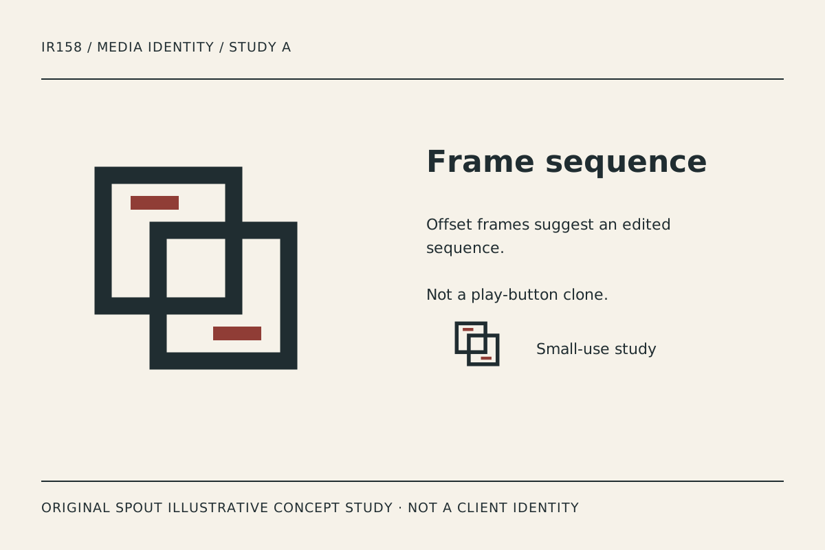
Frame sequence uses two offset open squares with short accent strokes. The intended reading is a relationship between frames rather than a familiar triangular play button. It leaves the media business free to define its actual content focus in the name and descriptor.
Its risk is congestion at the overlap. Compare the small counterpart and ask whether the open shapes remain distinguishable. A reduction that merges the junction loses the sequencing idea even if the outer silhouette remains visible.
For a proposed motion treatment, the frames could move into alignment, but that animation has not been supplied here. First choose a static endpoint that works on a credit, invoice and profile image. Motion should develop the identity, not conceal an unresolved mark.
Wave cut: sound interrupted by an editorial decision
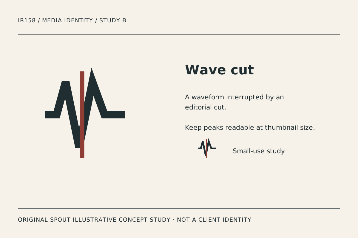
Wave cut combines a broad waveform-like line with a single contrasting vertical stroke. The interruption creates tension between continuous signal and an edit. It is the most audio-oriented direction in the set.
Avoid treating the drawing as a real recording or an audio-analysis result. The geometry is an original visual study. It does not depict a client’s voice, a measured frequency or a specific piece of music.
The peaks need careful reduction. If they turn into an illegible zigzag, simplify the relationship rather than adding more oscillations. Also inspect whether the accent line remains distinct in a monochrome application or whether an intentional alternate form is needed.
Editorial corner: a compact page-based identifier
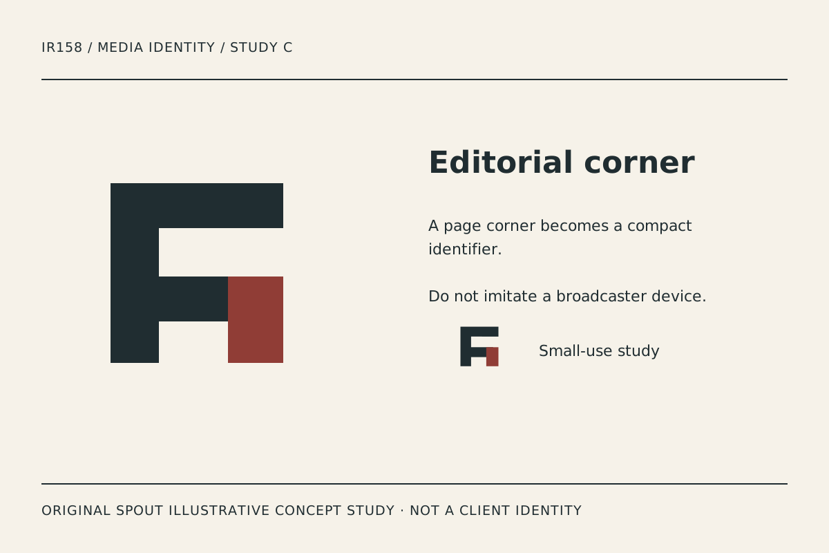
Editorial corner uses a strong stepped structure and a separate accent block. It can suggest a page edge or organised content without copying a masthead or broadcaster device. The broad silhouette makes it a useful contrast to the more linear studies.
Its abstraction means the final name and typography matter. Do not assume every viewer will identify the same letter or editorial association. Compare the mark in context and retain the feedback as qualitative design evidence.
The accent block should remain related to the main structure. If a tight crop separates it, the identity can look like unrelated fragments. Establish clear space and small-use variants in the final system rather than leaving cropping decisions to every social platform upload.
How do the concepts compare across media applications?
| Study | Main association | Useful test | Detail at risk |
|---|---|---|---|
| Frame sequence | Visual editing | Screen credit and profile image | Overlap density |
| Wave cut | Audio and interruption | Podcast artwork and one-ink document | Narrow waveform peaks |
| Editorial corner | Publishing structure | Masthead-like placement and footer | Detached accent block |
These are original design readings, not proof of audience trust or recognition. The right direction depends on the business brief and the actual contexts in which people encounter the identity.
A static-to-motion handover record
Retain the selected static master, intended lock-up with the real name and a record of the smallest application. If motion is commissioned later, specify its final frame, duration requirements and non-moving counterpart through that separate brief.
Do not add an invented sound logo or copy a recognisable broadcaster animation to make the study feel complete. Rights and distinctiveness need their own investigation. A visual direction can be useful while those questions remain unresolved.
For vector delivery, preserve the intended viewport and proportions. SVG’s coordinate mapping supports different output sizes but does not ensure a dense waveform or overlap remains readable. W3C SVG geometry.
For linked digital logos, W3C says the alternative text should convey the action or destination. For these gallery images, the alternative and caption instead explain the original study. Avoid a filename as the only description. W3C functional-image guidance.
Compare the chosen study on light and dark contexts using deliberately prepared variants, not an automatic recolour of an unrelated brand mark. Record the actual version used so the identity does not drift across screens, print and documents.
An original drawing is not proof of trademark clearance or ownership of a similar name. Keep the final rights process separate from the aesthetic preference and do not present concept work as a portfolio of completed client projects.
Discuss the direction through Spout’s logo and brand design service or start an enquiry with the preferred concept and application record.
For a social avatar, inspect the actual platform crop rather than only the square source canvas. Retain a preview showing the surrounding name and interface. A complete symbol inside the export can still lose an important corner or accent when displayed in a circular or otherwise constrained space.
Test the chosen creative mark in the web development brief beside actual portfolio captions.
By Spout Team. Prepared with AI-assisted drafting and original SVG concept artwork.