


A real-estate logo should identify the business clearly across listings, signs and documents without implying property ownership, verified title or investment performance. The original studies here compare a courtyard plan, a threshold and interlocking plot-like ribbons. They offer alternatives to another generic roof silhouette.
Each image is an original Spout illustrative concept study, not a client identity, development plan or official property mark. Download the SVGs to inspect their structure and compare the smaller counterpart before building a brief around the preferred direction.
What kind of real-estate business is being named?
Clarify whether the identity is for an agency, property manager, developer or another actual service. These roles should be explained in accurate wording rather than inferred from a large building symbol.
Also identify which application matters most: listing thumbnails, a roadside sign, a document heading or a staff profile. A mark designed only for a dramatic building mock-up may fail where customers most often see it.
WIPO describes trademarks as distinguishing goods or services and recognises several visual forms. A property identity does not need a roof or key, but it does need a distinct relationship to the real business name. WIPO trademarks.
Courtyard plan: space organised around a centre
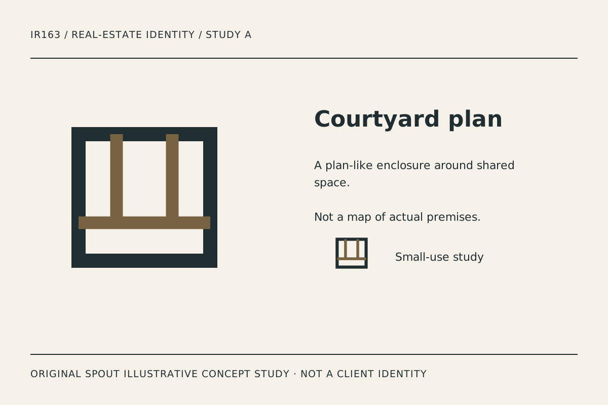
Courtyard plan uses an outer square and interior walls around an open central space. It suggests a plan-like organisation without representing an actual building, property boundary or development layout.
The study is strongest when the internal spaces remain visible. Test a small listing avatar and a plain document stamp. If the inner lines merge with the border, adjust the hierarchy rather than adding more architectural detail.
A plan reference can support a brief about organised space, but it should not imply surveying, architecture or title-verification expertise the business does not hold. The visual metaphor and service description need separate evidence.
Threshold: a recognisable entrance without a roof
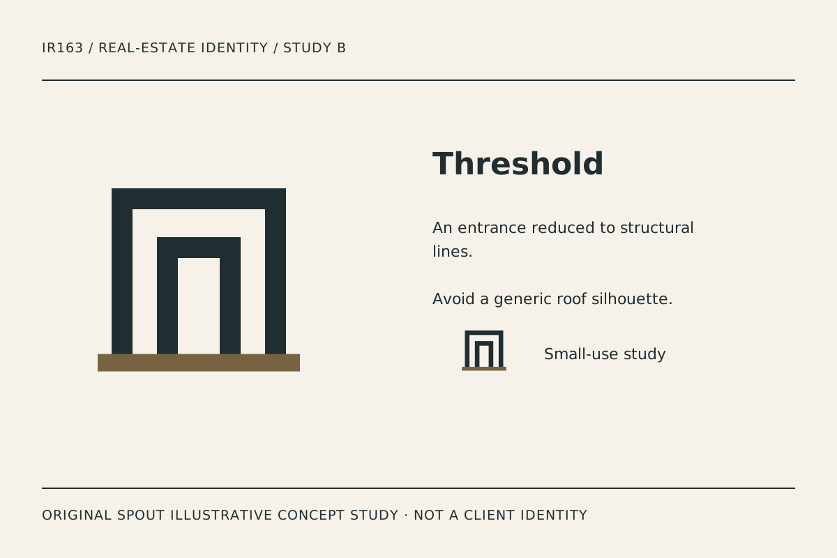
Threshold uses nested uprights and a firm baseline. The intended idea is an entrance rather than a specific house type. That gives it a broader architectural reading than a detached-house pictogram.
The baseline creates stability in a horizontal lock-up, but it can also become too dominant beside a delicate wordmark. Compare the actual name and typography early. A symbol and a name that each work separately may still compete when combined.
Test the opening inside the smaller counterpart. Cropping or thickening can turn it into a generic block. A deliberate small-use version should retain the entrance relationship rather than merely remove whichever detail disappears first.
Plot ribbon: an abstract relationship between parcels
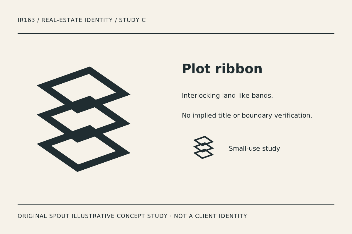
Plot ribbon uses repeated interlocking bands. It suggests related spaces or layers without drawing a real cadastral map. The diagonal rhythm gives the set a more dynamic alternative to the squared courtyard and upright threshold.
Its overlaps create the greatest visual complexity. Inspect whether the central junction remains clear when the mark is reduced or reproduced in one ink. If the junction becomes congested, simplify the structure in the master.
Do not present the study as a verified boundary, ownership record or map of stock held by an agency. It is original illustrative geometry. Any actual property claim belongs in the listing and supporting records, not in the assumed meaning of the logo.
How do these directions compare on real-estate touchpoints?
| Study | Structural idea | Application to test | Risk to investigate |
|---|---|---|---|
| Courtyard plan | Shared central space | Small listing avatar and stamp | Internal walls becoming dense |
| Threshold | Entrance and baseline | Sign and long-name lock-up | Opening lost through cropping |
| Plot ribbon | Related parcels | Document heading and profile image | Congested overlap |
The table is editorial design analysis, not a claim about sales performance or public recognition. Ask what remains readable at the actual use size and record the observations.
A listing-and-sign identity test
Use the real business name and contact information on a proposed listing tile, a sign layout and a plain document heading. Keep the property photograph separate from the identifier so the mark does not obscure useful listing information.
For a sign, consider the space required for the actual message and contact route. Do not invent a guaranteed reading distance or claim a road-visibility test has been completed. Produce and inspect the relevant sample before finalising production details.
For a listing thumbnail, compare the mark beside competing visual information such as a property title and status. The purpose is clarity, not to create a badge that looks like an official verification mark. Avoid invented sold records or client names in the examples.
Retain the SVG master with its intended proportions. The viewBox maps drawing coordinates to the output area; it does not justify stretching an emblem across an unrelated sign shape. W3C SVG coordinate systems.
What should the final handover preserve?
Record the preferred construction, actual name treatment, approved colour references and any deliberate small-use variant. Keep a sample of the applications used to make the decision so later changes can be compared against the original purpose.
On the website, a linked production logo should have alternative text that identifies the destination or action. These gallery images instead describe the studies and their illustrative status. W3C functional images.
Investigate the proposed name and resemblance questions through the applicable rights process before commercial adoption. An original drawing is not proof of trademark clearance, a property licence or professional status.
Discuss the direction through Spout’s logo and brand design service or start an enquiry with the preferred study and the applications it needs to support.
On a listing tile, keep the business identifier separate from the property status. A badge-like mark should not make a proposed, available or sold label look officially verified. Test the hierarchy using truthful example wording and retain the distinction in the final template.
Keep property identity, listing facts and contact routes connected in the web development brief.
By Spout Team. Prepared with AI-assisted drafting and original SVG concept artwork.