


A salon logo should remain recognisable across appointment messages, signage and product labels without relying on delicate decoration that disappears in everyday use. The original studies below explore flowing curves, a mirror-like form and a comb rhythm. Compare them with the actual salon name and the services it genuinely offers.
These are original Spout illustrative concept studies, not real salons, client projects or cleared trademarks. The downloadable SVGs provide visual alternatives and smaller counterparts so the discussion can focus on structure rather than a borrowed beauty-brand aesthetic.
What should the salon identity be built around?
Start with the service and customer experience. Hair styling, barbering, beauty treatment and product retail may overlap, but the business should state its actual scope. A mark does not need to illustrate every tool or treatment.
Choose the most important touchpoints. A shop sign allows more space than an appointment avatar or a small bottle label. The identity needs a coherent relationship between name, symbol and descriptor across those contexts.
WIPO recognises words, letters and drawings as possible marks. That leaves room for a distinctive name treatment rather than an automatic silhouette, crown or pair of scissors. The issue is identification, not adherence to an industry cliché. WIPO trademarks.
Flow lock: broad curves with a deliberate cut
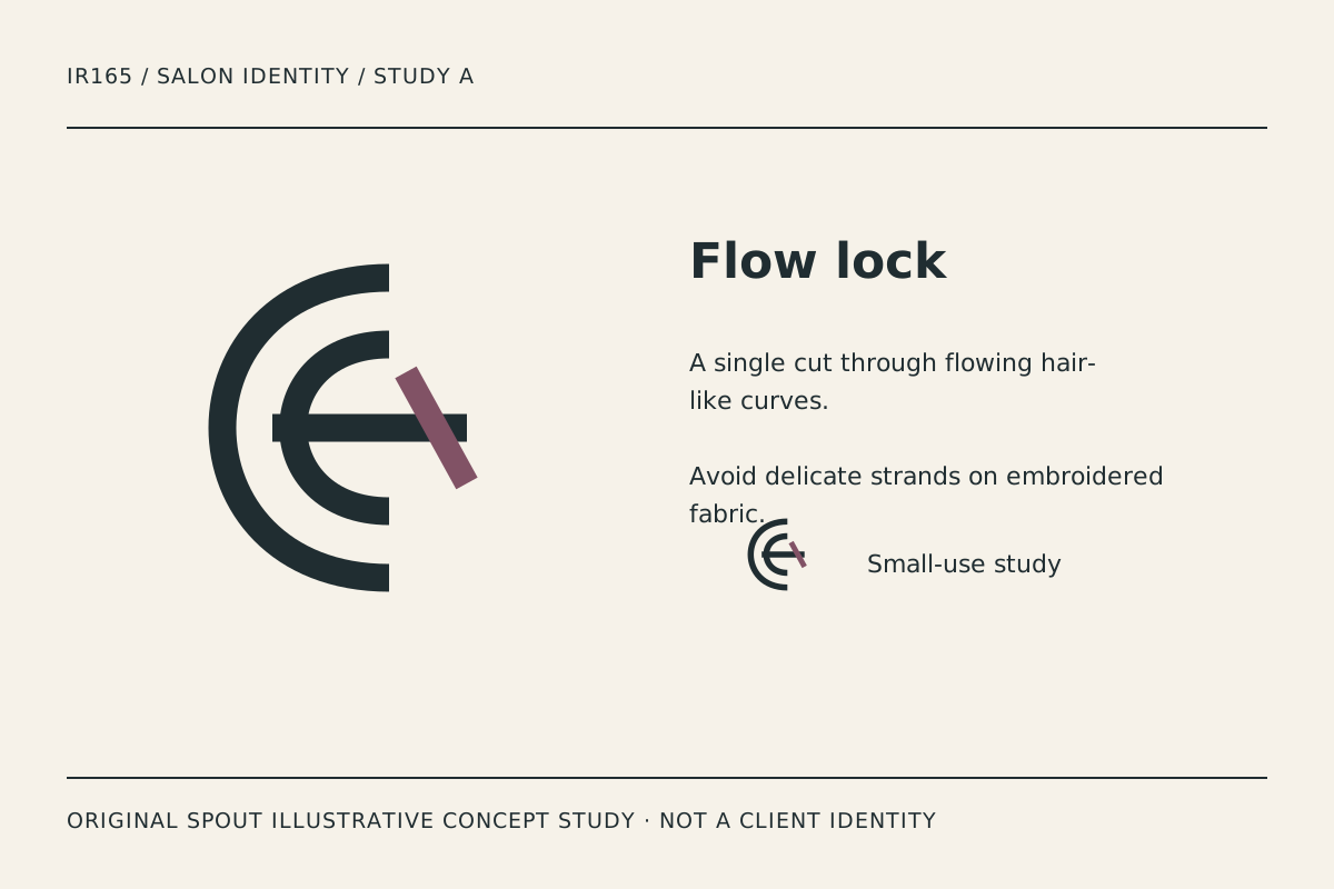
Flow lock uses nested open curves and a contrasting diagonal cut. It suggests a hair-like movement without drawing a person’s face or copying a hairstyle photograph. The strong strokes make the construction visible in the specimen.
The diagonal interruption gives the mark its tension. If it becomes too heavy, it can look detached from the curves; if too light, it may disappear. Compare that relationship at the actual small use rather than adding more strands to make the idea literal.
A garment application needs its own sample. Embroidery can alter open spaces and stroke ends, so the digital master should not be declared production-ready solely because the screen version looks crisp. Record any intentional simplification as a separate approved variant.
Mirror fold: an oval with a firm base
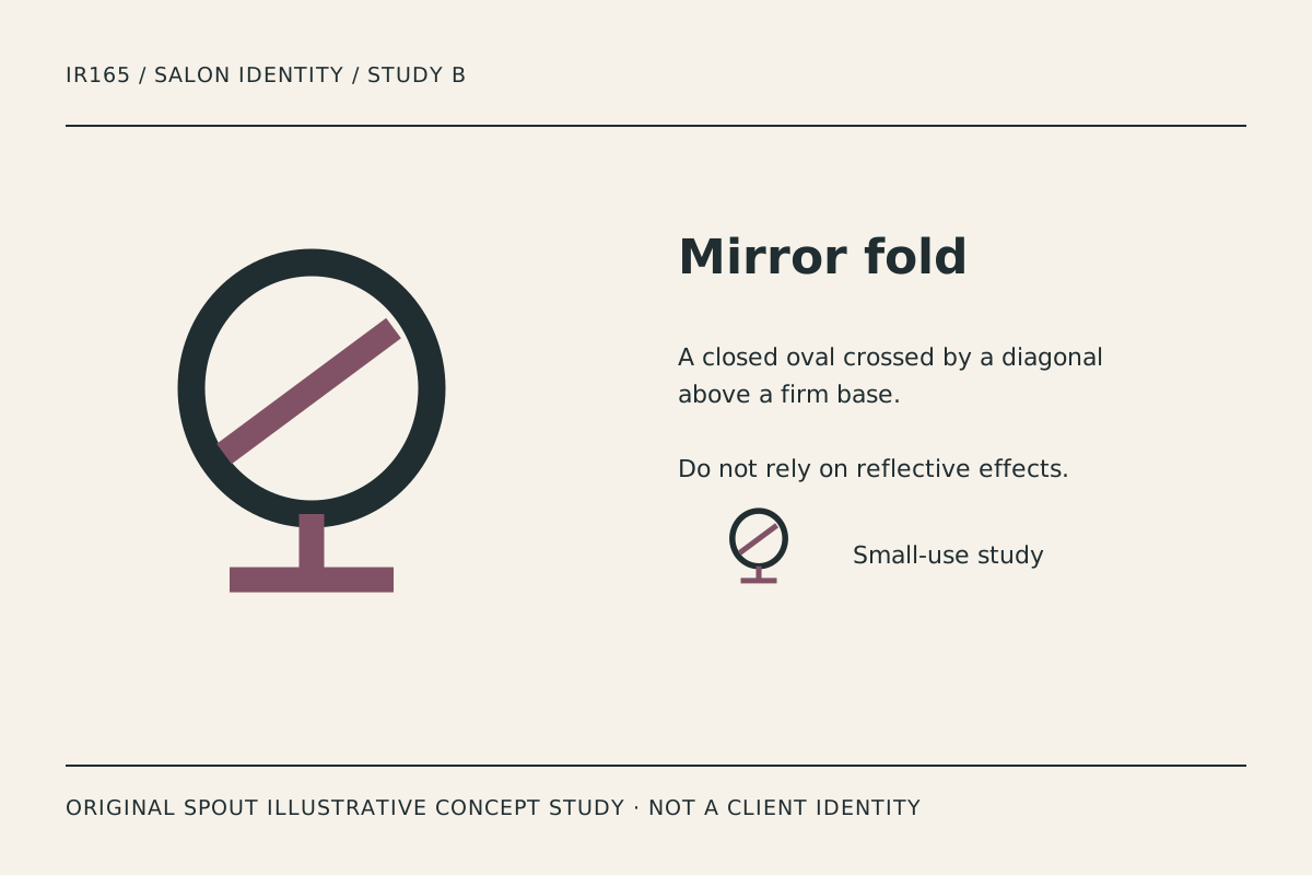
Mirror fold combines an oval, diagonal accent and base. It refers to a salon environment through a simple object structure rather than a reflective effect. The diagonal gives the study a distinct internal relationship.
Avoid adding a simulated shine or metallic gradient to rescue an unclear outline. The shape should remain recognisable in an ordinary one-ink document and a small digital icon. A future material finish can develop the identity after that basic test.
The base is a useful crop check. If a profile image trims it away, the mark can become a generic oval. Establish clear space and a deliberate small-use arrangement rather than letting every upload produce a different composition.
Comb rhythm: a tool reference reduced to pattern
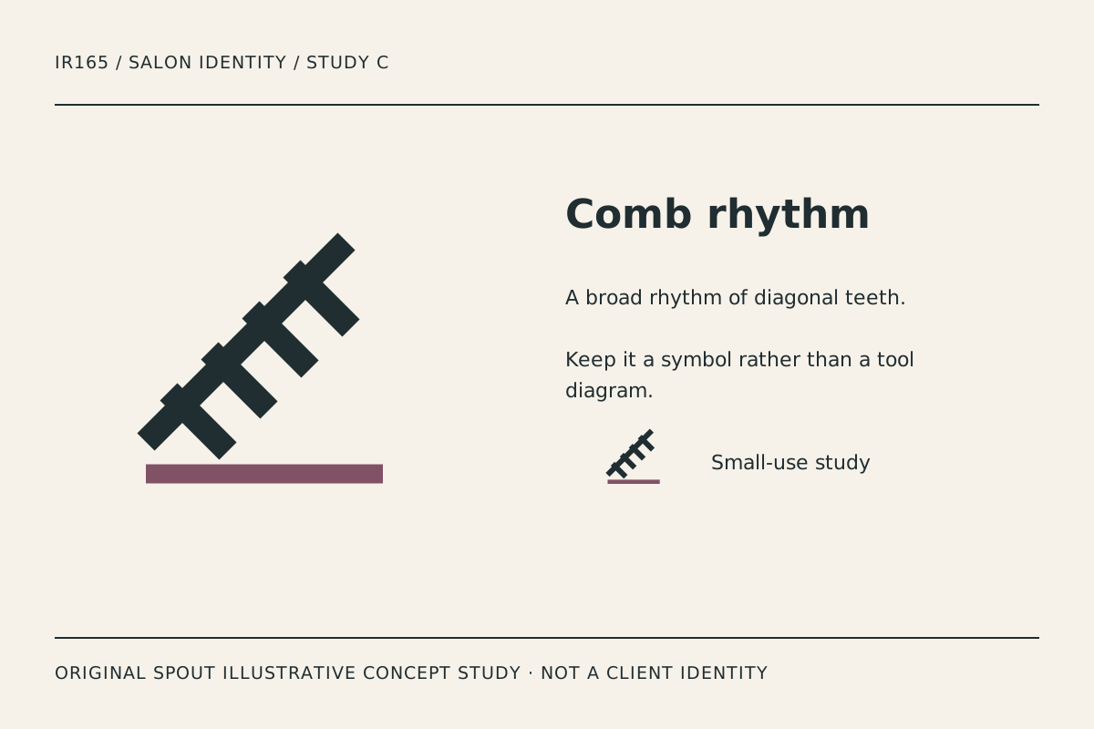
Comb rhythm uses a diagonal spine with broad teeth and a separate baseline. It is the most explicitly tool-related study, but the simplified geometry avoids a detailed product diagram.
The repeated teeth create a rhythm that may support a brief focused on precision or craft. That is a visual interpretation, not a claim about staff qualifications or treatment outcomes. Keep those statements in accurate service information.
Test the teeth at the smallest label size. If they merge into a serrated block, reduce the complexity deliberately. The number of teeth is not a business claim, and it should be chosen for the mark’s structure rather than decorative realism.
Which direction suits the salon’s applications?
| Study | Main reference | Application to compare | Detail to watch |
|---|---|---|---|
| Flow lock | Movement and a cut | Workwear and profile image | Curve gaps and diagonal weight |
| Mirror fold | Salon space | Signage and document heading | Oval/base relationship in crops |
| Comb rhythm | Precision through repetition | Product label and small stamp | Teeth merging at reduction |
The comparison contains original design judgement, not a claim that a particular symbol attracts a particular clientele. The actual name and service positioning should guide the choice.
An original appointment-to-sign proof sheet
Apply the preferred study beside the real salon name on an appointment reminder, a simple sign layout, a business card and a product-label sample where relevant. Use truthful placeholder content that does not invent a client, treatment result or certification.
Inspect the identity in each context without explaining the concept first. Ask what is readable, which element is remembered and what becomes unclear. Record qualitative observations rather than turning a handful of comments into a fabricated recognition statistic.
Then compare a version without the accent colour. Colour can add character, but essential separation should be considered deliberately. If the one-ink form needs a change, retain that variant in the master set instead of allowing a producer to improvise.
SVG provides a defined drawing area and coordinate mapping for scalable output. It does not guarantee that every tooth or gap remains legible on a small label. Preserve proportions and inspect the result. W3C SVG coordinate systems.
What should be checked before adoption?
Keep the proposed name, symbol and actual service descriptor together in the rights investigation. An original drawing does not prove that a similar name or mark is available. WIPO’s general guidance is not a local registration decision.
For a website logo used as a home link, provide alternative text identifying that destination or action. The gallery descriptions instead explain the visible study. Avoid using an image filename or unsupported prestige claim as the only text alternative. W3C functional images.
The final handover should preserve the chosen master, intentional variants and tested applications. A decorative mock-up alone is not a complete identity system. Keep the artwork distinct from the actual Spout brand and from any real client’s identity.
Discuss the direction through Spout’s logo and brand design service or start an enquiry with the preferred study and proof sheet.
Include the salon mark in the web development brief beside the actual service names and contact route.
By Spout Team. Prepared with AI-assisted drafting and original SVG concept artwork.