


A trucking logo needs a clear silhouette on a vehicle, document and workwear without implying safety certification, carrying capacity or routes the business has not established. The original studies below compare a simple axle bridge, a route cut through a solid block and a set of load rails. They provide different structural ideas rather than borrowed carrier marks.
These are original Spout illustrative concept studies, not client fleets, official transport signs or cleared trademarks. Download the SVGs to inspect their geometry and smaller counterparts before developing a real name treatment or vehicle application.
What should the trucking brief make explicit?
State the business’s actual activity and intended audience. A haulage operator, owner-driver and coordination business may need different emphasis. Do not add a globe or regional map to suggest a service footprint that has not been confirmed.
Identify the vehicles and surfaces on which the final identity will appear. A cab door, trailer panel and document heading provide different shapes and viewing contexts. The logo study is only one part of that application problem.
WIPO recognises words and drawings among possible marks and describes their role in distinguishing goods or services. A trucking identity can therefore be abstract without losing legitimacy; the accompanying name and service wording provide the actual business context. WIPO trademarks.
Axle bridge: a vehicle reference without detailed illustration
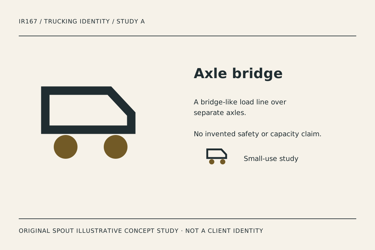
Axle bridge uses an angular upper outline and two separated circular supports. It is the most recognisably vehicle-related study in the set, but it avoids a detailed drawing of a particular truck model.
The circles and body need to remain distinct. In a small stamp, a heavy outline can fill the gap and turn the mark into a dense block. Compare the small counterpart and a physical proof before deciding the relationship is reliable.
Do not interpret the drawing as a statement about the company’s actual fleet. It does not depict an owned vehicle, payload or equipment specification. Those facts belong in accurate business records and service copy, not an assumed reading of the symbol.
Route notch: a path through a solid mass
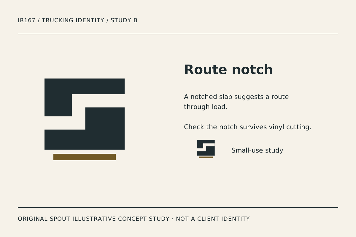
Route notch removes a stepped path from a broad rectangular form. It offers a more abstract identity, where the negative space rather than a literal truck carries the idea of movement.
The notch must survive the intended production process. For cut vinyl, inspect the actual sample and whether the inner corners remain controlled. Do not invent a universally safe cut width or assume every producer will reproduce the same small opening.
The solid silhouette may work well beside a long name, but that should be demonstrated in the actual lock-up. A broad mark can also become too dominant on a document heading. Compare the hierarchy rather than treating visual weight as automatic strength.
Load rail: repeated horizontal structure
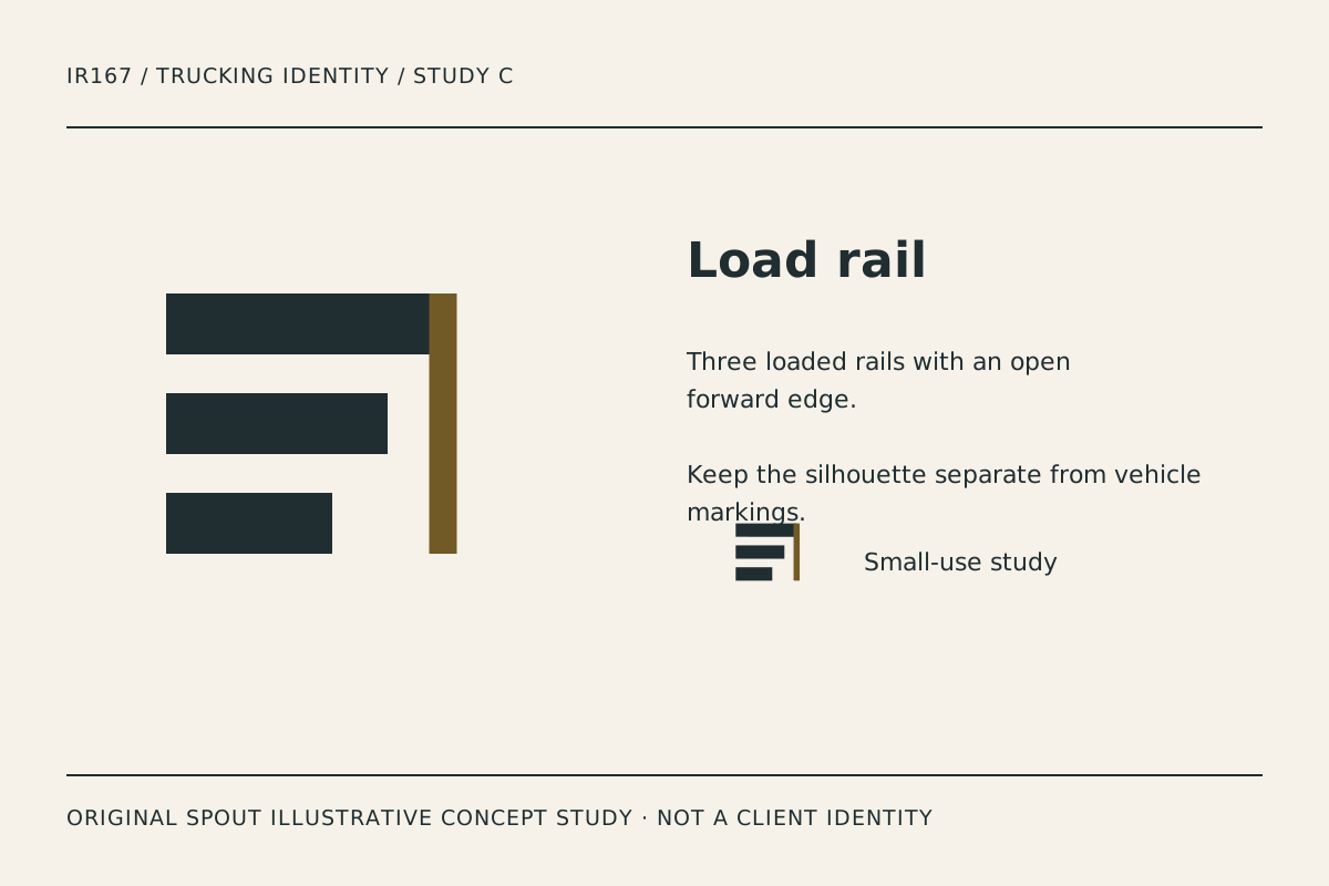
Load rail uses progressively shorter bars and an open forward edge. It suggests an organised load or rail structure without illustrating cargo or implying a specific transport category.
The vertical accent creates a clear end condition. If it disappears in one-ink use, decide whether the remaining bars are sufficiently distinctive or need an intentional alternate construction. A colour-dependent detail should not vanish accidentally across applications.
The stepped bars are simple enough to inspect at small size, but simplicity alone does not establish uniqueness. A final identity needs a relationship to the actual name and an appropriate resemblance investigation before commercial adoption.
How should the studies be compared on fleet materials?
| Study | Visual idea | Useful test | Risk to investigate |
|---|---|---|---|
| Axle bridge | Vehicle structure | Cab-door layout and stamp | Body and wheels merging |
| Route notch | Movement through negative space | Cut-vinyl sample and document heading | Notch closing or dominating |
| Load rail | Organised horizontal load | Workwear and small profile image | Accent disappearing in one ink |
These are editorial application suggestions, not visibility measurements or safety assessments. The concept artwork does not supply legally required vehicle markings or establish an exemption from any actual requirement.
An original vehicle-application proof record
Place the preferred study beside the real business name on a representative vehicle-panel outline. Keep required operational information and other markings accounted for through the appropriate actual process. Do not let the identity obscure information that needs to remain visible.
Create a plain document heading, garment sample and small avatar comparison as well. A symbol that looks strong on a large trailer mock-up can fail in an email attachment or on a uniform detail.
Record the material, output size and production method used. Inspect actual samples where possible and note which detail fails first. Do not claim a guaranteed reading distance or road-tested recognition without performing and documenting the relevant assessment.
Retain the vector master with the intended proportions. SVG’s viewBox maps drawing coordinates into the output area; it does not justify stretching a mark across a convenient vehicle panel. W3C SVG geometry.
What should the final identity avoid promising?
Avoid invented safety awards, capacity figures, certifications and destination claims. A visual language of strength or movement is not evidence that the business holds those capabilities. Keep the actual service description authoritative.
For a linked production logo, W3C recommends alternative text based on the action or destination. The gallery images instead describe the studies and their original illustrative status. W3C functional images.
Investigate the name and symbol through the applicable rights process before adoption. Original code and geometry do not establish trademark clearance. Keep the concept studies separate from real carrier identities and completed client work.
Discuss a tailored identity through Spout’s logo and brand design service or start an enquiry with the preferred study and vehicle-application record.
Carry the chosen trucking identity into the web development brief without inventing fleet size or service coverage.
By Spout Team. Prepared with AI-assisted drafting and original SVG concept artwork.