


A boutique logo needs to work where customers actually encounter it: the storefront, a garment label, packaging and the small profile image beside a message. The original studies below offer three different starting points rather than a collection of borrowed fashion marks. Compare the cut label, stitched loop and display rail against your own name and products.
Every image is an original Spout illustrative concept study. None represents a real boutique, a client commission or a cleared trademark. The downloadable SVGs are intended to make the design discussion concrete, including where each direction could fail in production.
What should the boutique identity express?
Begin with the merchandise and buying experience. A carefully edited clothing boutique, a mixed gift shop and a made-to-order studio may need different visual emphasis. Do not use a generic luxury treatment to conceal an undefined brand proposition.
Write down the name, product mix and most important physical application. If labels carry the identity more often than a large sign, that should influence the design from the start. A beautiful storefront mock-up does not establish that the same details survive on woven fabric.
WIPO distinguishes the role of a mark from the particular form it takes: words, letters and drawings can all contribute. There is no requirement that a boutique use a dress silhouette or a hanger. WIPO trademark overview.
Folded label: make the product touchpoint the idea
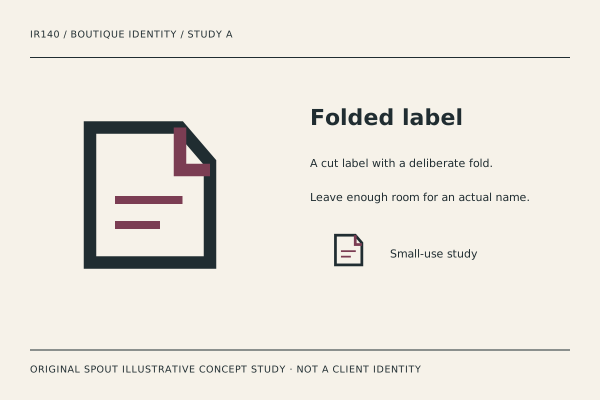
Folded label uses a firm outline and a cut corner, with the fold and interior strokes carrying the accent. It suggests an attached label without pretending to be an actual product tag or a statement about manufacturing quality.
This direction leaves a clear place for a real name in a larger lock-up. Avoid squeezing the entire business description into the small interior strokes. The symbol and the information label can share a system without becoming the same object.
Test it on the intended label material and a plain packaging sticker. The folded corner should remain distinct from an accidental crop. If the outline is printed over a textured surface, inspect whether the internal strokes remain visible rather than assuming the digital preview predicts the result.
Stitch loop: character through an interrupted seam
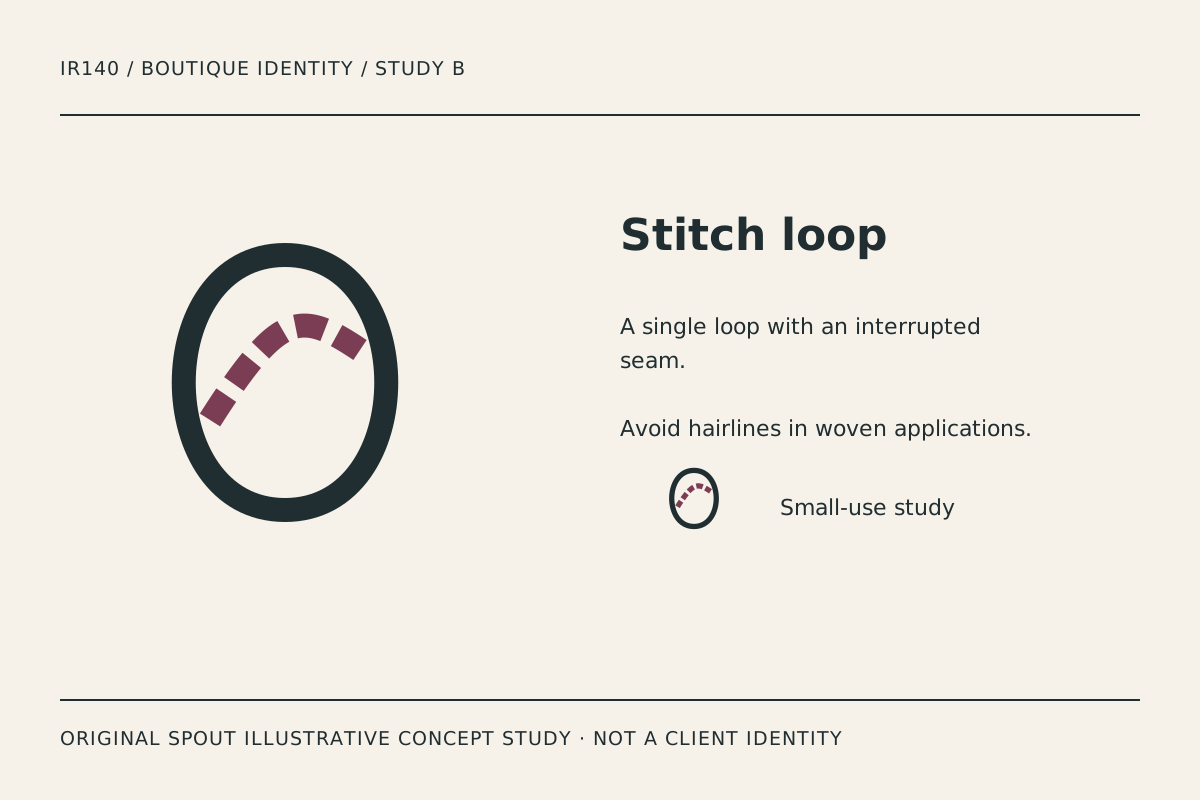
Stitch loop combines an oval boundary with a broken curved seam. Its character comes from the relationship between continuous and interrupted lines, rather than from adding decorative flourishes around the business name.
The direction may support a brief emphasising making, alteration or tactile detail. That is a visual reading, not a claim that the business manufactures its own products. Keep the actual business description accurate even when the design uses a craft reference.
The seam is the first detail to test at small size. If the gaps fill or the marks look like random dots, simplify deliberately. A woven or embroidered version may need different spacing from a printed card, and that variant should be documented rather than improvised by each producer.
Display rail: a shop-space reference
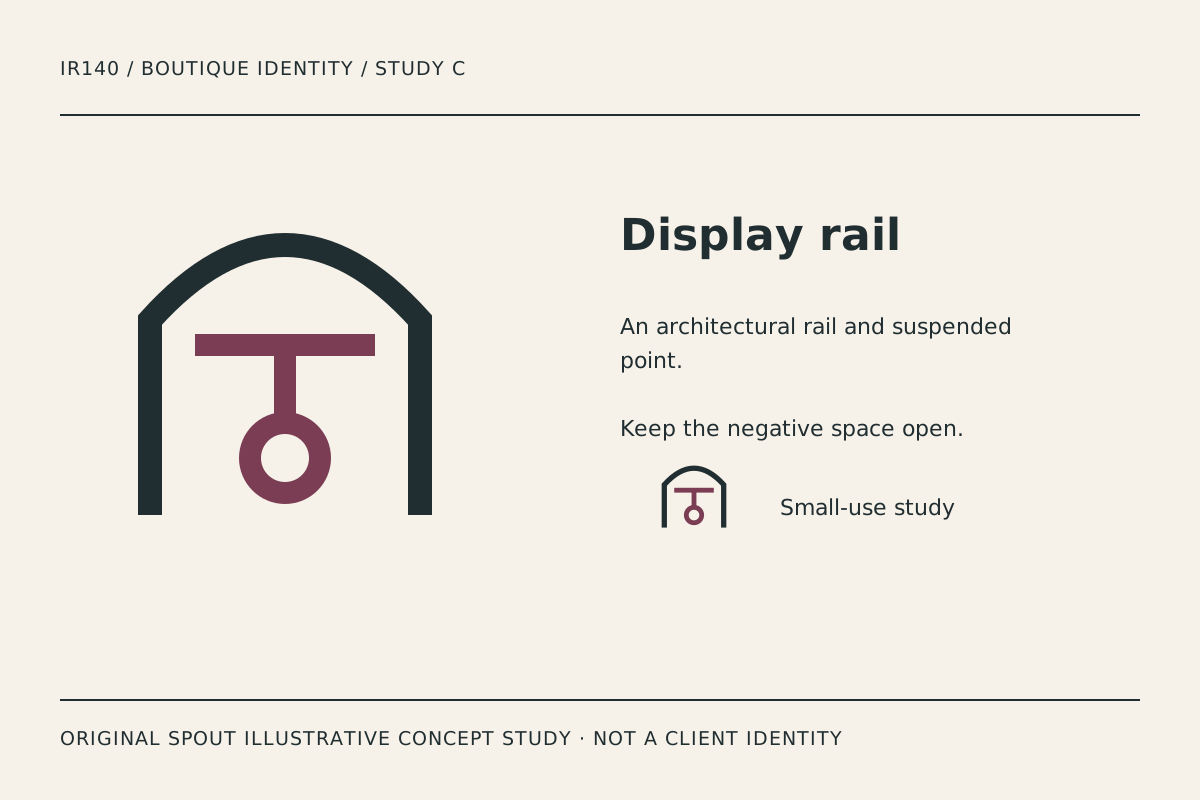
Display rail uses an architectural arch, a horizontal rail and a suspended ring. It refers to the experience of browsing a space without drawing a literal rack full of clothing. This makes it the most spatial direction in the set.
Its openness is useful when the identity needs breathing room beside a short name. The risk is that the central ring can disappear or become a separate dot in a tiny avatar. Compare the small counterpart before deciding whether the hanging element needs simplification.
If the boutique sells products beyond clothing, the abstract structure can remain flexible. Do not make that flexibility an excuse to avoid a clear brand brief; the final typography and application system still need to connect to the actual merchandise and audience.
How do the studies compare on real boutique materials?
| Study | Main reference | Useful application | Detail to inspect |
|---|---|---|---|
| Folded label | Product label | Sticker, tag and packing card | Cut corner and internal strokes |
| Stitch loop | Seam and making | Fabric label or printed tissue | Gap spacing in the seam |
| Display rail | Browsing space | Signage and profile icon | Suspended ring at reduction |
These are editorial application suggestions. They are not tested production specifications or promises about a particular printer. Obtain an actual sample from the intended process before treating a file as production-ready.
A boutique identity sampling record
Place the preferred study beside the real business name, then prepare a label, a packing sticker, a storefront view and a small digital profile comparison. Record which version people can distinguish without explaining the intended meaning first.
For each material, retain the size used, colours, production method and observed issue. Do not invent a universal minimum stroke or label size. A rough paper sticker and a woven label can fail differently even when their overall dimensions match.
Keep the vector master and an intentional simplified variant if one is needed. SVG defines a viewport and coordinate mapping; it does not authorise stretching a mark until it fills an unrelated package shape. W3C SVG coordinate systems.
When the logo links to the boutique homepage, use an appropriate destination text alternative. In this gallery, the descriptions instead identify the original study and its visible construction. W3C functional images.
Finally, investigate the proposed name and resemblance questions through the applicable rights process. Original artwork does not establish commercial clearance. Keep the final identity separate from concept examples and do not imply a portfolio of clients that does not exist.
Discuss the direction through Spout’s logo and brand design service or start an enquiry with the preferred study and the materials it must survive.
Carry the chosen garment-label identity into the web development brief with its actual product imagery.
By Spout Team. Prepared with AI-assisted drafting and original SVG concept artwork.