


An emblem logo brings its identifying elements into a contained structure, but the container should not make an ordinary business look officially accredited. The original studies here compare an interrupted ring, a framed crest and a clipped panel. Use them to explore hierarchy and reproduction before putting a name around a complicated badge.
These are original Spout illustrative concept studies. They are not official seals, awards, client identities or cleared trademarks. Each SVG can be downloaded to inspect the construction and compare the smaller version shown beside it.
When does an emblem help the identity?
A contained mark can organise a short name, initials or a simple symbol as a compact unit. That can be useful where a stamp, label or uniform patch is an important application. It becomes less useful when the shape forces essential wording into tiny lettering.
Start with the information that genuinely belongs in the identity. A founding date, certification statement or geographic claim should not be added as decoration unless it is true and appropriate. The visual authority of a seal is not evidence of an actual approval.
WIPO recognises words and drawings among possible trademark forms and distinguishes a mark’s identifying function from its particular appearance. A badge outline is therefore a design choice, not a prerequisite for legitimacy. WIPO trademarks.
Radial seal: containment with an intentional interruption
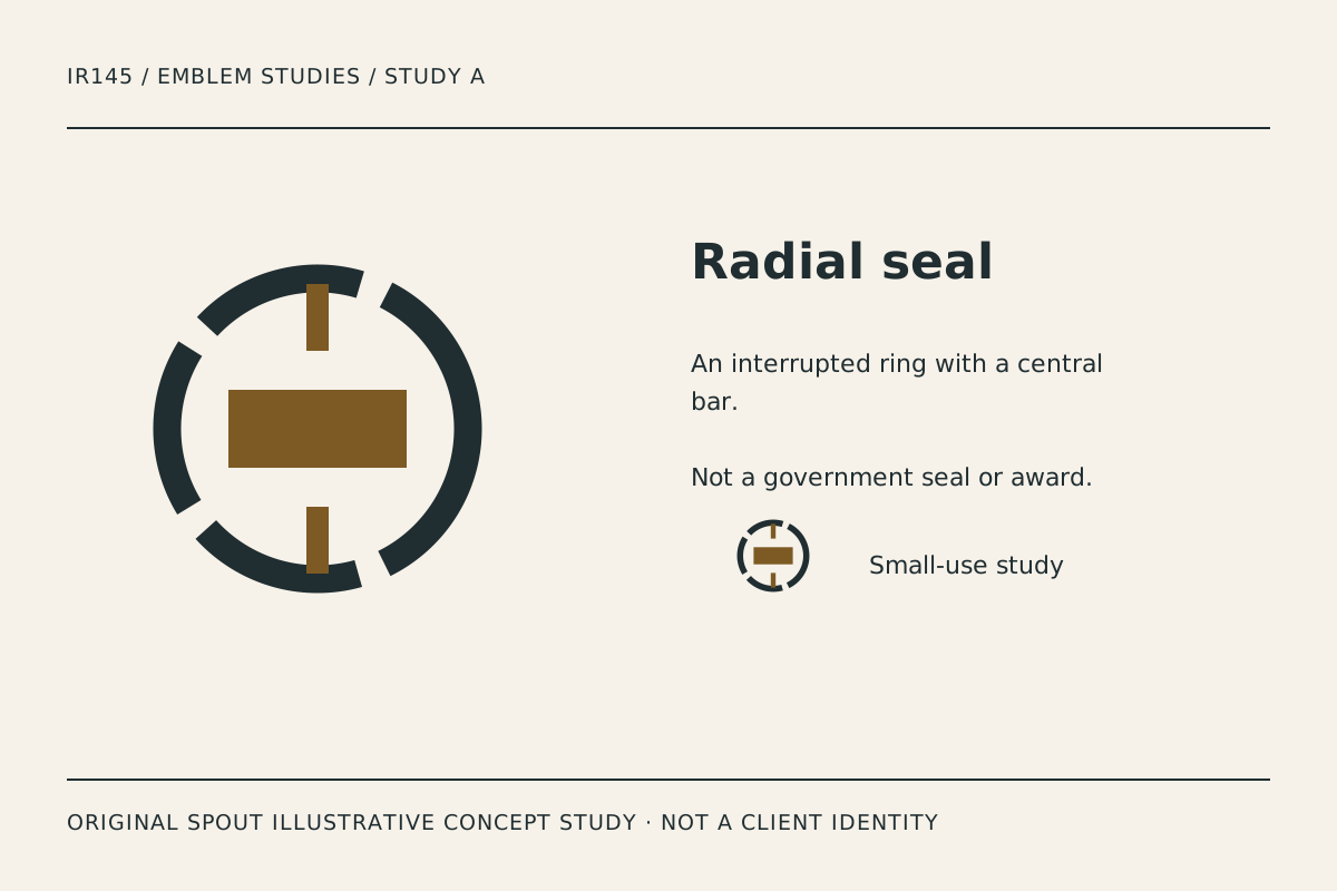
Radial seal uses a broken ring and a central bar. The gaps stop the perimeter becoming an uninterrupted official-looking border and create a recognisable rhythm without decorative stars or borrowed heraldry.
The central bar is deliberately plain. A final identity could explore how a real short name or symbol relates to it, but the study does not invent a business name or endorsement. Avoid filling the available area with several unrelated messages merely because the shape appears to provide space.
Test the ring gaps in a stamp impression. If ink spread closes them, the shape changes. A production adjustment should preserve the interruption rather than accepting whatever the supplier’s software happens to produce.
Framed crest: a shield without a fabricated authority story
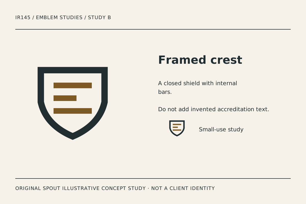
Framed crest combines a broad shield-like outline with a small set of internal bars. Its character is structural rather than ornate. The bars create hierarchy without using an eagle, crown, national symbol or invented institutional motto.
A shield can still suggest protection or authority, so compare that association with the business’s actual service. Do not describe the identity as proof of security, accreditation or professional status. The concept is an exploration of shape, not evidence supporting those claims.
The lower point needs particular attention on embroidery and small labels. If the point becomes too narrow or visually heavy, revise the geometry in the master and retain the changed version. Do not let different applications acquire unrelated shield shapes.
Panel badge: make the horizontal name the organising element
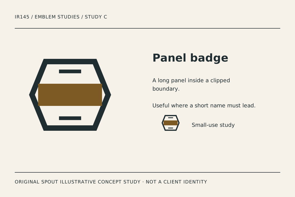
Panel badge places a broad strip within a clipped geometric boundary. It offers a different hierarchy from a circular seal: the eye reads the central band before the enclosing shape. This may be useful where a short wordmark should lead.
Its risk is congestion at the ends of the strip. A long name can push the surrounding boundary into a decorative frame with no useful relationship to the lettering. Test the actual wording early and allow the proportions to respond deliberately.
The top and bottom strokes should not become tiny imitation text. They are simple structural elements in this study. If a real descriptor is needed, give it a readable position and establish whether it belongs in every version of the identity.
Which emblem structure is most practical?
| Study | Visual hierarchy | Application to test | Main concern |
|---|---|---|---|
| Radial seal | Ring, gaps, central bar | Stamp and circular profile crop | Gaps filling in reproduction |
| Framed crest | Outline before internal bars | Uniform patch and document heading | Implied authority and narrow point |
| Panel badge | Horizontal band before boundary | Label and short-name lock-up | Wording becoming congested |
The comparison is original design judgement, not a consumer study. Ask which elements remain readable and distinct in the intended application rather than assuming an emblem always creates trust.
A useful emblem reduction record
Prepare the full structure, a simplified structure and a name-only version for comparison. These are proposed variants to develop, not files already included in the downloads. Record which information each version retains and why.
Test the smallest real use: perhaps a label, an email signature or a garment detail. Print or produce a sample where possible. A screen preview cannot establish how ink, thread or cutting affects a gap or a thin internal shape.
Keep a vector master with intentional proportions. SVG viewports and viewBox mapping help place artwork at different sizes, but they do not make an overfilled badge readable automatically. W3C SVG coordinates.
For a linked production emblem, the text alternative should identify the action or destination. A gallery image instead needs a useful description of the study. Avoid a filename or a claim such as “official quality seal” where no such status exists. W3C functional images.
Before adoption, investigate the name, symbol and relevant goods or services through the applicable rights process. WIPO’s international guidance is not a local registration decision. Original artwork and a polished presentation do not establish clearance.
Bring the preferred structure, actual name and intended applications to Spout’s logo and brand design service, or start an enquiry with the reduction record.
If the final name does not fit the central structure, compare a separate name-and-emblem arrangement before shrinking the text. The smallest lettering should not become a decorative texture. Record the point at which the container stops helping the information hierarchy and choose a simpler variant deliberately.
Use the emblem at its intended size in the web development brief, without adding an unsupported accreditation label.
By Spout Team. Prepared with AI-assisted drafting and original SVG concept artwork.