


An IT company logo should give the business a recognisable visual identifier without pretending to prove its technical capability. The original studies below explore three directions: connected paths, controlled entry and a framed core. Use them as starting points for a brief, then test the chosen structure beside the real business name and actual services.
These are original Spout illustrative concept studies, not client identities, official platform logos or cleared trademarks. Each downloadable SVG includes a large symbol and a small-use comparison. The drawings are deliberately different strategies rather than colour variants of one stock icon.
Which IT logo direction fits the business you actually run?
A technical business may provide support, development, infrastructure or another defined service. Begin with that distinction. A shield-like mark can suggest protection even where the company has not established security expertise; a network symbol can imply an infrastructure focus that may not fit a software consultancy.
Write a brief that identifies the audience, principal service and desired character. Choose a memorable structural idea before adding initials. WIPO defines a trademark by its distinguishing function and recognises both words and symbols as possible forms. That is a reason to investigate distinctiveness, not evidence that any geometric mark is automatically available to register. WIPO trademarks.
Study A: Signal weave
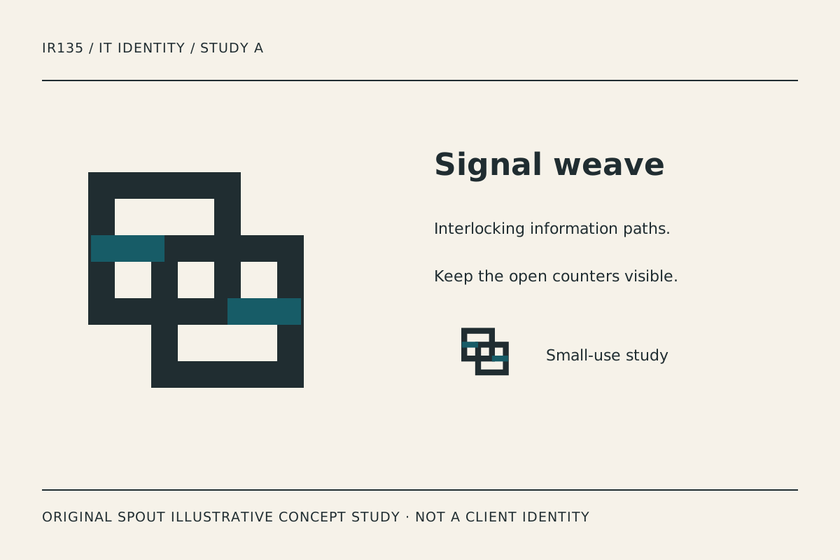
Signal weave uses two offset square loops, with accent bars identifying the crossings. The intended reading is connected information moving through an organised structure. It avoids a literal laptop or cloud outline, leaving room for a business whose services may evolve.
Its strength is the repeated right-angle rhythm. Its risk is that the crossing can become a dense block when reduced or embroidered. Compare the small counterpart with the large mark and inspect whether the open centres remain separate. If they merge at the intended output size, simplify the crossing rather than merely making the whole identity larger.
A wordmark could sit beside the symbol on a proposal cover, while the symbol alone could identify an application avatar. That is a proposed application, not a claim that the study has been tested on a particular platform or garment.
Study B: Protocol gate
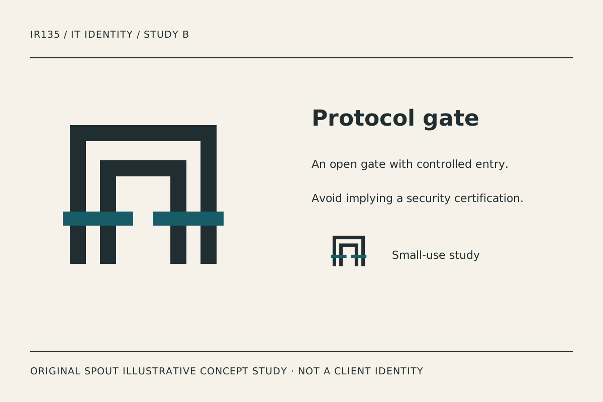
Protocol gate uses nested open frames and a horizontal interruption. It suggests an entry point with deliberate structure, making it a candidate for a business whose brief emphasises controlled workflows or access to services.
Do not present the symbol as a security certification or a promise that systems cannot be compromised. The reading is a design interpretation. If the business does not want an access-related association, this direction may be less appropriate than the weave or framed core.
Test the open lower edge in signage and cropped profile images. A crop that closes the opening changes the visual idea. The surrounding space is therefore part of the design problem, not unused area to remove automatically.
Study C: Stack frame
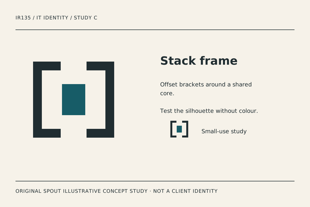
Stack frame places a solid core between opposing brackets. It is the most compact of these studies and can support a more editorial, software-oriented identity without depicting a particular programming language.
The central block is intentionally simple. It should not be filled with tiny circuitry to make the symbol feel more technical. Instead, test the relationship between the core, bracket thickness and the real name’s typography. A long company name may need a different horizontal arrangement from a short name.
The brackets also create a useful crop test: retain both sides at small sizes rather than leaving a single generic square. A simplified variant should preserve the central relationship, not become an unrelated icon.
How should the concepts be compared?
| Study | Structural idea | Most useful test | Risk to investigate |
|---|---|---|---|
| Signal weave | Interconnected loops | Small avatar and embroidery sample | Crossings become congested |
| Protocol gate | Open nested entry | Signage crop and clear space | Implied security promise |
| Stack frame | Core held by brackets | Long-name lock-up and favicon | Brackets disappear at reduction |
The table is editorial design analysis. It does not report consumer research or establish which idea will produce more enquiries. Ask viewers what they can distinguish and read, rather than telling them the meaning they are expected to see.
A practical IT identity test sheet
Place the selected study beside the actual business name on a proposal heading, website header, profile image and a plain document footer. Record which element remains recognisable when the mark is small and which detail fails first.
Then remove the accent colour and inspect the structure. Colour can help organise a mark, but it should not be the only evidence separating essential parts. Do not recolour an existing Spout logo for this exercise; these are separate original studies.
Retain the SVG master and document its dimensions. SVG’s viewport and viewBox define how drawing coordinates fit an output area; they do not guarantee a poorly proportioned symbol becomes legible when scaled. W3C SVG coordinate systems.
For web use, distinguish an informative study image from a linked production logo. W3C says functional-image alternatives should describe the action or destination. A home-link logo therefore needs an appropriate destination label, while this gallery needs honest descriptions of the studies. W3C functional images.
Record the chosen direction, rejected alternatives, smallest intended use and unresolved resemblance questions. An original drawing is not proof of trademark clearance. Before adopting a final identity, establish the applicable ownership and registration questions through the relevant process.
Discuss a tailored identity through Spout’s logo and brand design service or start an enquiry with the preferred study and its application tests.
For the final name treatment, compare an abbreviated display name with the full registered or trading wording the business intends to use. Keep the legal or administrative wording accurate without forcing it into the smallest symbol. The icon and full document identity can have different roles in the same system.
For a mark used online, carry the small-size test into the web development brief.
By Spout Team. Prepared with AI-assisted drafting and original SVG concept artwork.