


A medical-practice logo should help people identify the practice clearly without implying an approval, emergency role or clinical outcome that has not been established. These original studies explore an open path, an offset window and linked curved forms. They offer visual starting points for a real identity brief rather than a gallery of borrowed healthcare marks.
The SVGs are original Spout illustrative concept studies. They do not represent actual practices, completed client projects or cleared trademarks. No patient information, clinical photograph or official health-service emblem is used in the artwork.
What should a medical identity make clear?
Begin with the actual practice name and service description. Patients need to distinguish the organisation and find the right contact route. A reassuring-looking symbol cannot substitute for accurate information about what the practice does or who provides care.
Keep identity design separate from evidence of registration, qualifications or accreditation. Do not add an official-looking badge to make a concept feel more complete. The design should organise true information rather than create an authority story around an abstract shape.
WIPO recognises words and symbols as possible mark forms and describes their distinguishing role. That does not establish permission to use a particular healthcare symbol or clear a proposed name. WIPO trademarks.
Open path: a clear route without a cross
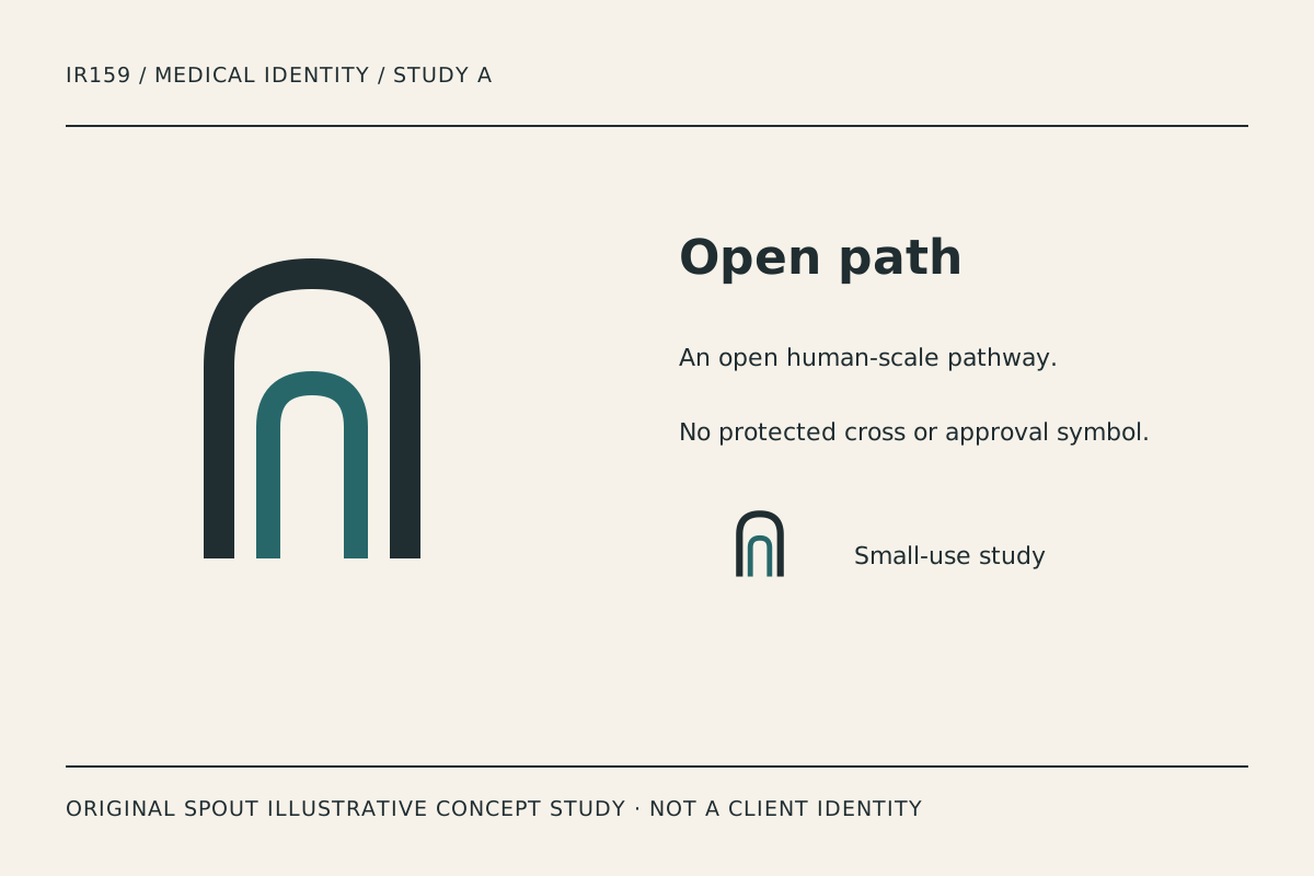
Open path uses two nested curved structures with an open lower edge. The intended reading is an approachable route or entrance, not a treatment result. The accent gives the inner path a distinct role while the dark outer shape holds the silhouette.
The opening deserves attention in small use. If a crop removes it, the symbol can become a generic closed arch. Test the actual profile image and document header rather than assuming a square export will preserve the intended relationship.
This direction can be compared beside a long practice name because its vertical shape leaves a clear horizontal space. That is an application hypothesis, not a claim that patients prefer it or that it improves clinical trust.
Care window: clarity through offset space
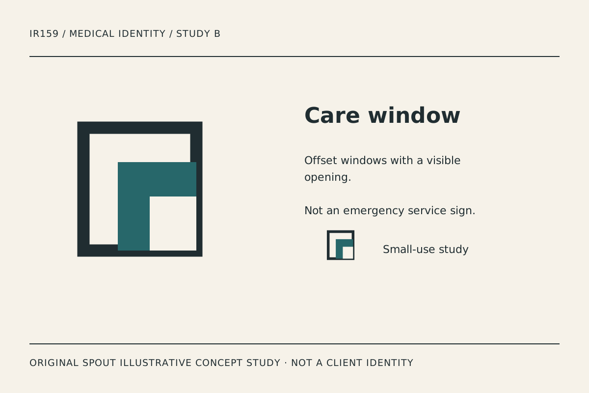
Care window combines a firm outline with offset interior planes. It suggests a visible opening while avoiding a literal person, heart or medical cross. The design is deliberately architectural rather than diagnostic or anatomical.
Its main risk is that the internal white opening becomes too small in reduction. Inspect the small counterpart and a plain one-ink proof. If the opening disappears, simplify the geometry intentionally rather than sharpening the exported image and hoping the problem resolves.
The name care is a study label, not a claim that a real service has been supplied. A final practice identity should be developed with its actual name, audience and applications instead of adopting a concept title as an invented business identity.
Linked petals: two unequal forms in dialogue
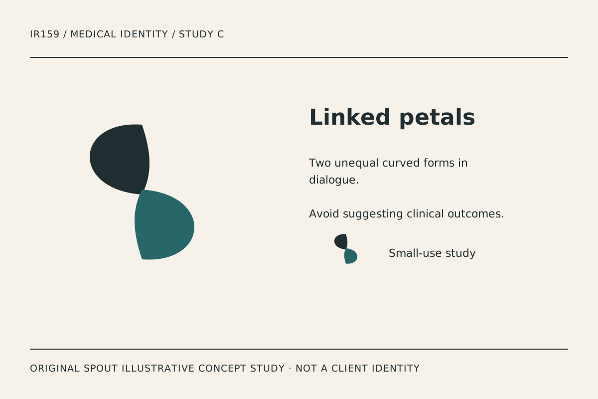
Linked petals uses two curved shapes meeting around the centre. Their unequal orientation creates a quieter, more organic direction than the architectural studies. The intended association is relationship, not a biological illustration.
Compare the shape without the accent colour. The meeting point should remain understandable rather than turning into a single indistinct blob. A small appointment-card print is a useful physical test because it exposes whether the gap and curves remain controlled.
Avoid adding claims about healing, wellbeing or outcomes to explain the symbol. The visual interpretation is editorial design judgement. Any service claim belongs in accurate practice information with its own evidence.
How should the concepts be compared?
| Study | Character | Application to test | Boundary to preserve |
|---|---|---|---|
| Open path | Structured and open | Long-name document heading | Opening must survive the crop |
| Care window | Clear and architectural | Appointment card and small icon | Inner space must remain visible |
| Linked petals | Organic and relational | Printed stationery and profile image | No implied clinical outcome |
The table does not rank the studies by patient confidence or business results. No such research has been performed. Ask what people can identify and read in the actual application, and record their observations without turning them into invented statistics.
A patient-facing identity application record
Use the actual practice name on a sample appointment card, direction sign, document heading and website header. Check the hierarchy between the name, service description and contact information. The logo should not displace information people need to act.
Test readability at the intended output size and on the material to be used. Do not invent a universal minimum size or assume a screen preview predicts embroidery, signage or paper. Record the observed issue and the version used.
Retain the vector master with deliberate proportions. SVG defines the viewport and coordinate mapping, supporting scalable output but not guaranteeing every internal gap remains readable. W3C SVG coordinate systems.
For a linked practice logo, W3C’s functional-image guidance makes the destination or action the important alternative text. The gallery images instead describe their original construction. Do not use an unsupported label such as officially approved practice mark. W3C functional images.
Before adoption, investigate the proposed name and symbol through the applicable rights process and confirm the practice’s authorised wording separately. Original artwork is not proof of clearance, and a medical-looking identity is not evidence of clinical suitability.
Keep concept studies clearly separate from real practice imagery and completed client work. The downloads can support a thoughtful brief without implying a history of commissions that does not exist.
Discuss the identity through Spout’s logo and brand design service or start an enquiry with the preferred study and actual application needs.
Use the practice’s actual contact and location wording in the application proof. Check that the hierarchy directs people to the correct service without making an emergency-service implication. The symbol can remain abstract while the surrounding information supplies the practical clarity a patient needs.
Carry the practice-name and contact hierarchy into the web development brief without adding clinical claims.
By Spout Team. Prepared with AI-assisted drafting and original SVG concept artwork.