


A photography logo should identify the photographer without competing with the photographs. The original studies below explore a radial framework, an open horizon frame and an exposure ladder. Compare them as a portfolio signature, small profile image and restrained watermark before choosing a direction.
These are original Spout illustrative concept studies, not client identities or marks taken from photography brands. The downloadable SVGs include large and small comparisons. They do not include photographs, a completed portfolio system or a claim that any concept is cleared for commercial use.
Does the logo need to show a camera?
Not necessarily. A wordmark or abstract symbol can identify the business without illustrating the equipment. Begin with the photographer’s actual name, type of work and intended applications rather than assuming every photography identity needs an aperture icon.
A wedding portfolio, documentary practice and commercial studio may need different tone and hierarchy. That is a brief decision, not a reason to invent a client list or a visual style the photographer does not use.
WIPO recognises words, letters and drawings as possible mark forms. The useful question is how the final identity distinguishes this business, not whether it contains the expected industry pictogram. WIPO trademarks.
Radial framework: a central junction with six compartments
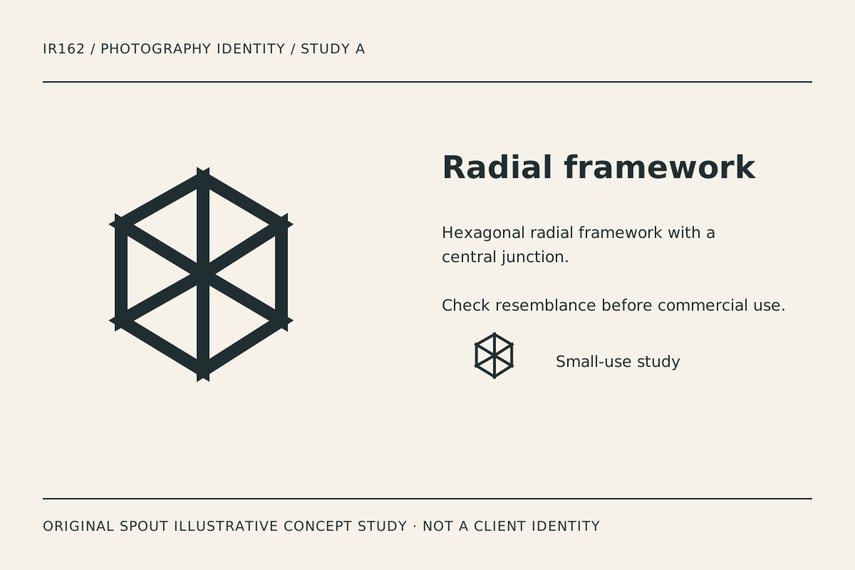
Radial framework uses six outlined triangular compartments around a central junction. The angular structure can suggest composition or technical precision; it does not depict overlapping aperture blades or an open central hole.
The risk is familiarity. Radial geometry appears in many identities, so an original drawing does not establish an exclusive visual territory. If this direction is pursued, develop its relationship to the real name and investigate resemblance through the appropriate process.
Test the central intersection at small size. If the lines become a dense star, reconsider the number of segments or their meeting point. A detailed mark should not be defended merely because its geometry is mathematically tidy.
Horizon frame: let the image remain the main event
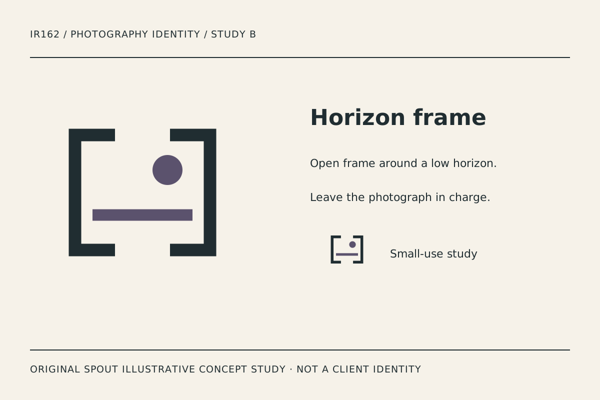
Horizon frame uses opposing open brackets, a low horizontal stroke and a small circular accent. It suggests composition rather than equipment. The open area can feel less visually dense beside a photograph than a filled emblem.
The symbol is not a literal landscape or an assertion that the photographer specialises in travel. Compare it with actual portfolio work before adopting that reading. The name and application system should supply the business context honestly.
For watermark use, inspect whether the thin visual relationship remains apparent over different images. A watermark that disappears on one background or dominates another needs a deliberate alternative. Do not solve every case by adding a large opaque box without considering the photograph.
Exposure steps: rhythm instead of a lens silhouette
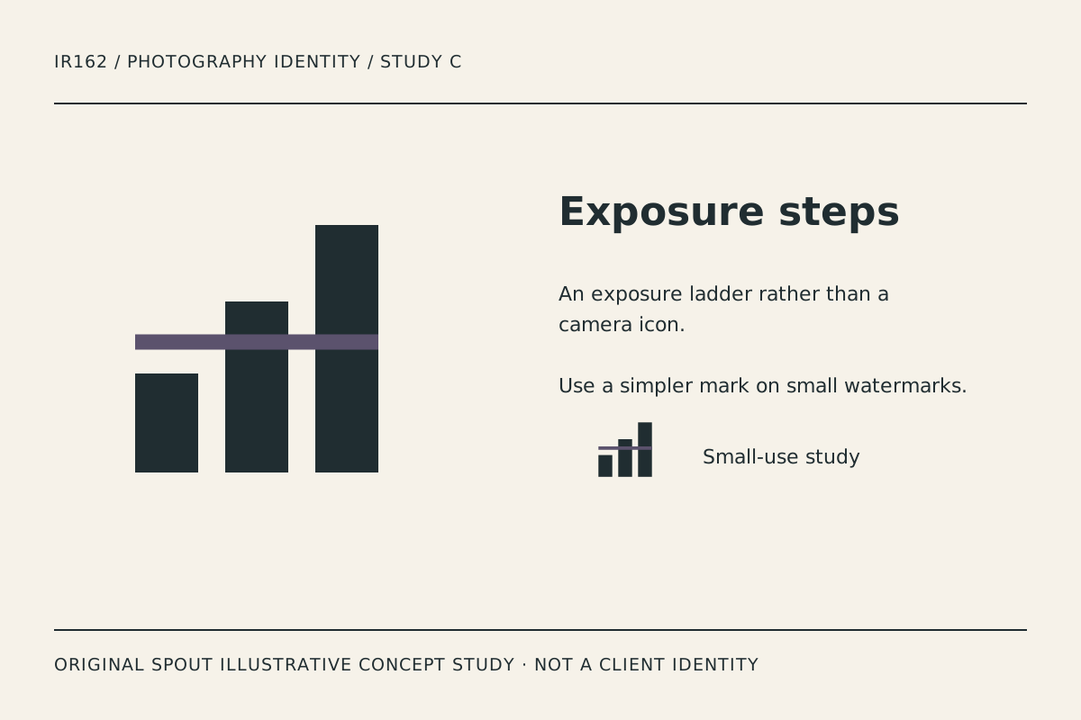
Exposure steps uses rising bars crossed by an accent line. It is the most abstract study in the set and can suggest an organised sequence or tonal progression without reproducing a camera control.
The broad bars create a strong silhouette, but they may also resemble an unrelated chart. Compare the concept beside the actual name and portfolio context. Do not claim that viewers will universally recognise exposure from the symbol alone.
The line crossing the bars is a detail to test in reduction. If it becomes noise, a simplified variant may be appropriate. That change should be intentional and retained in the final asset set rather than occurring unpredictably in individual exports.
Which study fits the actual portfolio?
| Study | Visual emphasis | Useful application | Concern to investigate |
|---|---|---|---|
| Radial framework | Angular radial construction | Profile image and portfolio cover | Familiarity and dense centre |
| Horizon frame | Composition and open space | Website signature and watermark | Background-dependent visibility |
| Exposure steps | Abstract rhythm | Document heading and small icon | Reading as an unrelated chart |
These are original design observations, not evidence of client preference or conversion performance. The comparison should include actual portfolio material owned or legitimately supplied by the photographer.
An original watermark and portfolio test record
Place the chosen study beside the real name on a portfolio header, contact sheet and plain document. Then test a restrained watermark on a set of authorised sample photographs with different tonal backgrounds. Keep those photographs out of this concept gallery unless their publication rights are established.
Record the mark version, position and size used. Ask whether the identifier remains readable without taking attention from the subject. Do not invent an opacity or size that is universally correct for every image.
A watermark is an identifier within the composition, not evidence of a particular licence agreement or permission to use someone else’s photograph. Keep image rights and logo rights as separate records. The study downloads do not supply rights to unrelated portfolio material.
For vector delivery, preserve the coordinate mapping and proportions. SVG scaling does not guarantee that an intricate centre or narrow gap survives every output. W3C SVG coordinate systems.
For web use, distinguish a linked production logo from an informative study. W3C advises destination- or action-based alternative text for functional images. In a gallery, describe the actual construction rather than presenting a filename or an invented client name. W3C image guidance.
Retain the preferred direction, actual name treatment and rejected alternatives in the brief. Before adoption, investigate resemblance and the applicable registration questions. Original geometry alone does not establish clearance.
A useful identity can remain quiet. It should make authorship and contact recognisable while allowing the photographer’s actual work to carry the visual story.
Discuss the direction through Spout’s logo and brand design service or start an enquiry with the preferred study and portfolio applications.
For a watermark variant, compare the complete name with the symbol alone. A recognisable symbol may be useful for an established audience, but the business should not assume new viewers already know it. Record which version supplies enough identification in the actual portfolio context.
Test the chosen photography identity in the web development brief against real portfolio images at different crops.
By Spout Team. Prepared with AI-assisted drafting and original SVG concept artwork.