


Poster design needs 5 decisions: viewing context, primary message, reading order, production and response route. Start with what a person should recognise at the intended distance, then add the information needed when they move closer. A poster should not require its audience to read a compressed brochure before understanding its purpose.
Which poster hierarchy works for the setting?
Define the setting before selecting a visual style. A notice viewed across a room, an event poster in a corridor and a digital poster forwarded on a phone have different reading conditions. Record where the audience will encounter it and whether they can stop to read. Do not invent a universal viewing distance; use the actual placement or clearly label a proposed setting as a design assumption.
Compare a headline-led direction for an announcement whose wording carries the main idea. The visual system should support a clear title and practical follow-up details. For a fictional lecture, the subject can lead while the speaker and attendance instructions form a second level. This is an example composition, not evidence that a real event exists or that an unseen poster has passed visual review.
Compare an image-led direction where a scene or product supplies immediate recognition. Select an authorised image that leaves room for essential text without hiding its focal point. A powerful image cannot compensate for a missing date or a confusing location. Keep the representation truthful: stock or generated imagery should not imply that the pictured people, premises or event belong to the business when they do not.
Compare a typographic direction when the message benefits from a strong verbal identity and imagery would add little. Use contrast, alignment and spacing to establish a clear sequence. Avoid choosing an unusual typeface merely to make the poster look designed. The audience still needs to distinguish the main message from supporting information and recover the practical details comfortably at the intended scale.
Build a reading hierarchy from the actual content. Decide what should be understood first, what supports that understanding and what a person needs to act. Move extended explanations to a relevant destination where appropriate. If every line is equally prominent, the design has not made the editorial decision. Ask the content owner which message must survive a brief glance rather than guessing from the supplied document order.
What should be checked before production?
Confirm factual details independently of style. Check names, dates, locations and contact destinations against approved source material. Keep a copy owner responsible for changes. A designer may improve phrasing, but should not invent an event schedule, accreditation or availability claim to fill space. Retain factual approval separately from visual approval so a layout sign-off does not silently validate unsupported content.
Obtain production specifications from the actual print provider. Adobe’s printer-mark instructions explain the role of marks and advise confirming what the provider expects. Record the finished size, material and required file setup. Do not borrow a bleed or image-resolution figure from another job and present it as a universal requirement. A physical display and a digital distribution copy need different output treatment.
Run appropriate technical checks on the production document. Adobe’s preflight guidance identifies issues including missing fonts, modified links, overset text and low-resolution images. Configure the relevant profile and inspect the reported issues. A technical pass cannot prove that the poster is readable in its setting, but it can prevent an otherwise approved layout reaching production with broken assets or hidden text.
Review a proof in the intended context. Inspect the first-glance message from the actual viewing position, then approach to read the details. Ask someone unfamiliar with the brief to explain the poster’s purpose and action. Record any misunderstanding rather than relying on the designer’s explanation. A presentation mock-up can be useful, but should not be represented as a physical production proof.
Prepare the response route and digital companion deliberately. A printed QR code should lead to the intended page and have an understandable alternative where practical. A poster already viewed on a phone needs a usable link in its accompanying text. Remove print-only marks from digital artwork and check its preview. Preserve the same factual message even when the digital composition uses a different crop or hierarchy.
Add a late-change rehearsal to the production handoff. Change a fictional location or contact route in the approved source, then identify every output that must be regenerated. Check the physical-print version, digital poster and accompanying text separately. A corrected master does not repair an older exported file already circulating in a shared folder. Use a clear version reference and retain the final approval against the actual export. This is especially useful for event posters, where a small factual correction can matter more than a decorative refinement. The exercise tests asset control without implying that any real event, schedule or production run exists.
Three original visual studies
These original SVG studies use fictional names and sample copy. They are illustrative comparisons, not actual clients, events, approved identities or production-ready artwork. The supplied screen renders have been inspected; physical reproduction and responsive application still need their own checks.
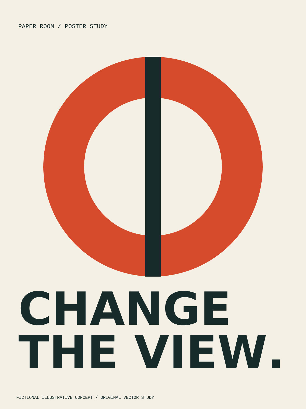
Aperture uses an interrupted red circle above CHANGE THE VIEW. The single symbol gives the poster a clear focal point; added practical details must not collide with the headline.
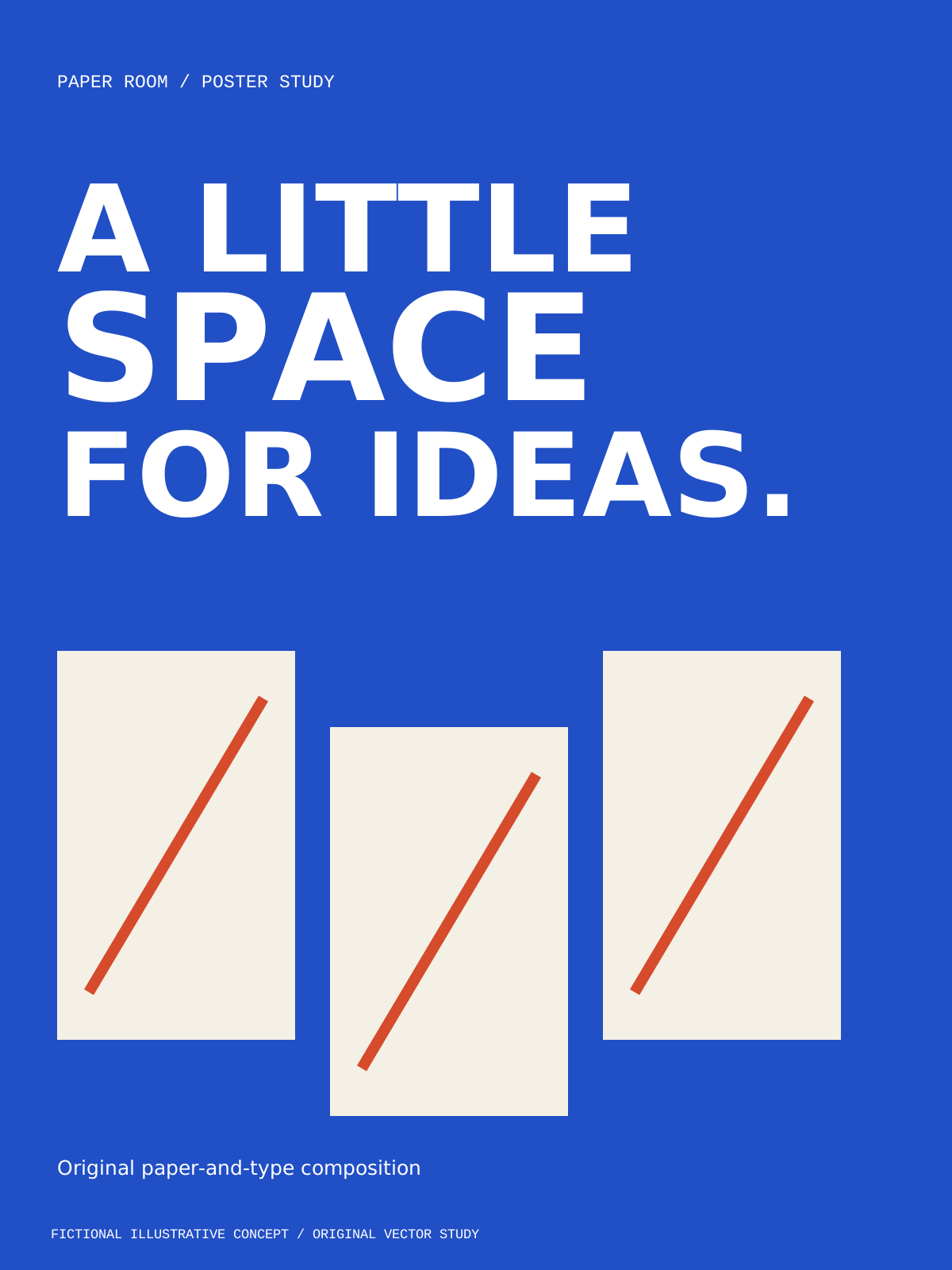
Offset sheets puts the verbal invitation above three staggered paper forms. Preserve their gutters when adapting the proportions, rather than stretching the complete canvas.
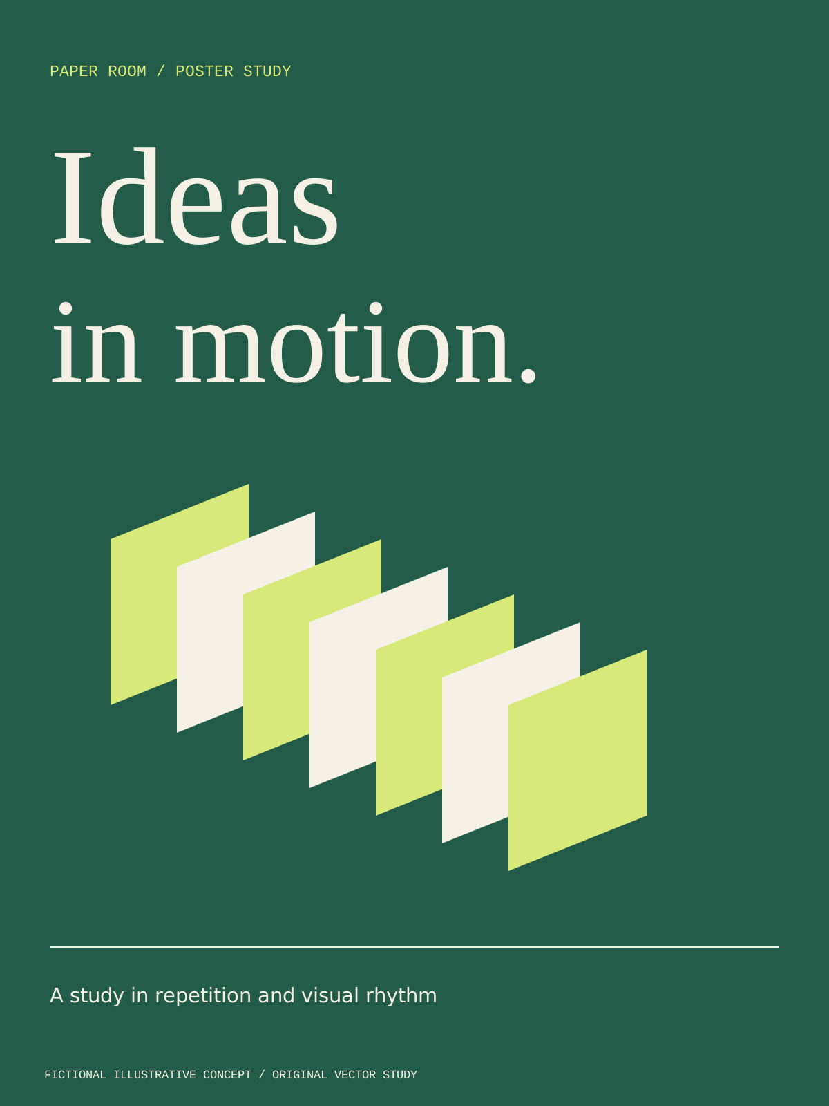
Paper rhythm uses alternating shapes to move diagonally beneath a serif headline. Its overlap and contrast should be checked in the actual production method; this screen render is not a one-colour print proof.
Decision worksheet
Original contribution: a two-distance poster proof card. For a fictional event, write what must be understood from the placement’s first viewing position and what may be read after approaching. Compare headline-led, image-led and typographic directions against those tasks. Keep the factual copy identical while comparing hierarchy. Record the physical proof result separately from a digital preview and a technical preflight result. This makes each approval meaningful: correct content, useful visual communication and acceptable production files are related but distinct findings.
| Checkpoint | Evidence to retain | Decision or corrective action |
|---|---|---|
| Viewing context | Placement and observed reading conditions | Test the actual setting |
| Message | Primary idea and practical details | Choose headline, image or type-led direction |
| Reading order | First-glance and close-reading tasks | Remove competing priorities |
| Production | Provider specification and preflight evidence | Resolve asset or text defects |
| Response | Checked destination and digital companion | Make the next step usable |
As a worked review, ask a reader to identify the event subject before looking for its location. Then ask how they would obtain further information. If the location dominates before the subject, the hierarchy may be reversed. If the action depends entirely on a tiny code, the response route may need another form. Revise the relevant element and repeat the task instead of enlarging every line. The exercise provides specific feedback without inventing a minimum type size or a claimed attention span.
See logo and brand design for identity context and social media management for digital distribution. To discuss a poster, get started with approved content, existing assets and the placement brief.
By Spout Team. AI-assisted drafting by Codex using the linked primary sources.