


A restaurant logo needs to work on a menu, a sign and takeaway packaging without claiming an award or a particular cuisine the business does not offer. These original studies explore a rising bowl, a table-plan corner and shared plates. Compare the structures with the actual restaurant name before choosing decorative effects.
The images are original Spout illustrative concept studies, not client restaurants, existing hospitality brands or cleared trademarks. Each SVG is downloadable and includes a smaller counterpart. The artwork is a visual starting point, not evidence of a completed restaurant identity or a food-quality certification.
What should the restaurant brief settle first?
Describe the food, service style and customer occasion accurately. A takeaway counter, a neighbourhood dining room and a reservation-led restaurant may need different visual priorities. Do not choose a fine-dining appearance merely to make the business seem more prestigious.
Identify the hardest everyday application. A paper bag stamp may expose detail problems that a large sign hides. A menu also needs room for food descriptions and prices supplied through the business’s own approved process; the logo should not consume the entire information hierarchy.
WIPO describes a mark by its distinguishing role and recognises words and drawings among possible forms. A restaurant identity therefore does not need a fork, chef’s hat or illustrated plate to be legitimate. WIPO trademarks.
Rising bowl: a broad shape with asymmetric movement
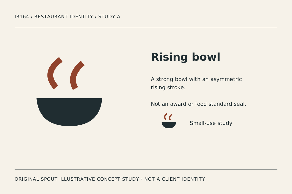
Rising bowl combines a solid lower form with two unequal curved strokes above it. It suggests serving and warmth without illustrating a particular dish. The asymmetry gives the study a different rhythm from a perfectly centred steam icon.
The gap above the bowl is important. If a small print closes it, the strokes and bowl can become one heavy shape. Test the actual stamp or sticker rather than judging only the large specimen.
The rising strokes are a design interpretation, not a promise that every item is hot, freshly prepared or made on site. Keep menu and service claims accurate separately. A symbol cannot supply the evidence for an operational statement.
Table corner: a contained place setting
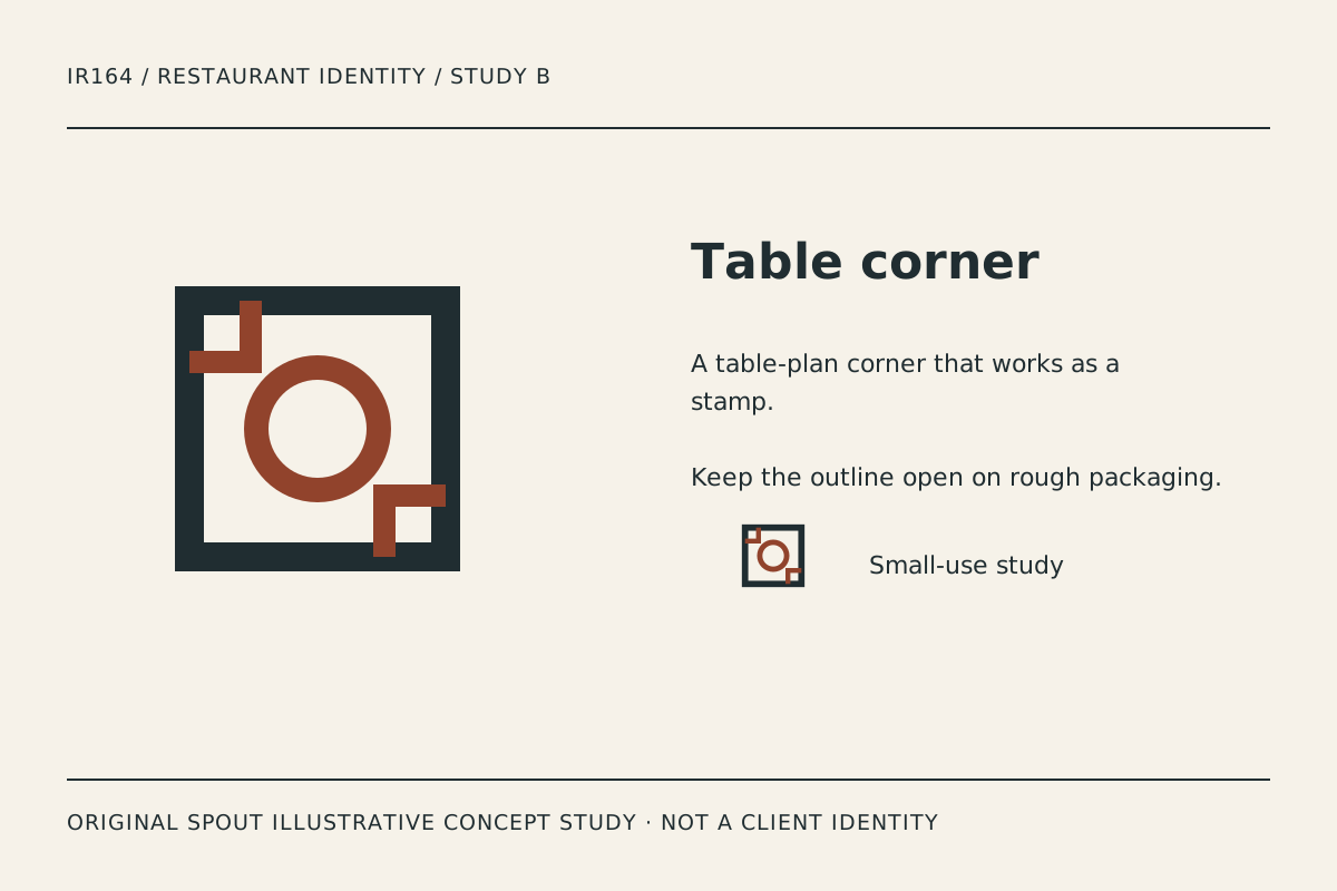
Table corner uses a square boundary, a central circle and offset corner details. It is the most architectural direction in the set, suggesting a place at a table without drawing cutlery or a specific dining-room plan.
The square form can help organise a compact label or stamp, but the internal shapes may become crowded on rough packaging. Inspect the open space around the circle and the separation of the corner details.
If the actual name is long, compare a separate wordmark rather than forcing all lettering into the square. A contained symbol does not require the entire identity to become a badge. The relationship between name and mark can remain flexible while the symbol itself stays consistent.
Shared plate: overlap as a hospitality idea
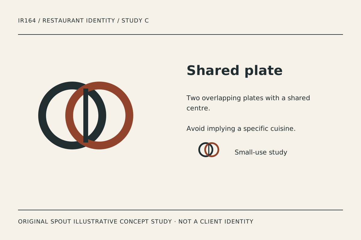
Shared plate uses two overlapping circles and a central dividing stroke. The intended association is a shared encounter, not a claim about a specific cuisine or service format. It offers a more relational direction than the bowl or table plan.
The overlap is the first detail to inspect in one-ink use. If the circles merge, the relationship changes. A final system may need an intentional alternate treatment rather than relying on two colours for every application.
Compare the study beside the restaurant’s real name on a takeaway sleeve and a menu cover. Record whether the symbol supports the name or becomes a separate decorative object that customers cannot connect to the business.
Which concept belongs on everyday restaurant materials?
| Study | Organising idea | Practical test | Concern |
|---|---|---|---|
| Rising bowl | Serving and upward movement | Bag stamp and small sticker | Gap closing above the bowl |
| Table corner | A defined place | Menu cover and package seal | Interior detail becoming dense |
| Shared plate | Relationship through overlap | Takeaway sleeve and sign | Colour-dependent separation |
This table is original design analysis, not a claim that one mark will increase bookings. The right comparison uses actual materials and the restaurant’s truthful service brief.
An original menu-and-packaging proof record
Prepare the preferred study with the real name on a menu heading, a plain takeaway bag, a package sticker and a sign layout. Label every application as proposed concept work until a final identity is agreed.
Record the material, production method and size used. A single-colour stamp, a printed sleeve and an illuminated sign can reveal different weaknesses. Do not invent a universal line thickness or promise that every printer can reproduce the file unchanged.
Check whether the logo interferes with useful information. On a menu, the customer needs to find sections and understand the offer. On a package, the brand should remain recognisable without obscuring information that belongs to the actual product.
Keep the SVG master with its intended proportions. The viewport and viewBox map artwork into the output area, but scaling alone does not solve a dense overlap or a narrow gap. W3C SVG geometry.
What should remain separate from the logo?
Awards, hygiene ratings, certification statements and origin claims need their own actual basis. Do not add a seal-like treatment to suggest those statuses. These studies deliberately contain no invented endorsement or client story.
For a linked restaurant logo on the website, use alternative text that identifies the destination or action. These gallery images instead describe the visible study and its original illustrative status. W3C functional images.
Investigate the proposed name and resemblance questions through the applicable rights process before adoption. Original artwork does not establish trademark clearance or permission to imitate another restaurant’s identity.
Discuss a tailored direction through Spout’s logo and brand design service or start an enquiry with the preferred study and proof record.
Use the chosen restaurant identity in the web development brief with readable menu and contact information.
By Spout Team. Prepared with AI-assisted drafting and original SVG concept artwork.